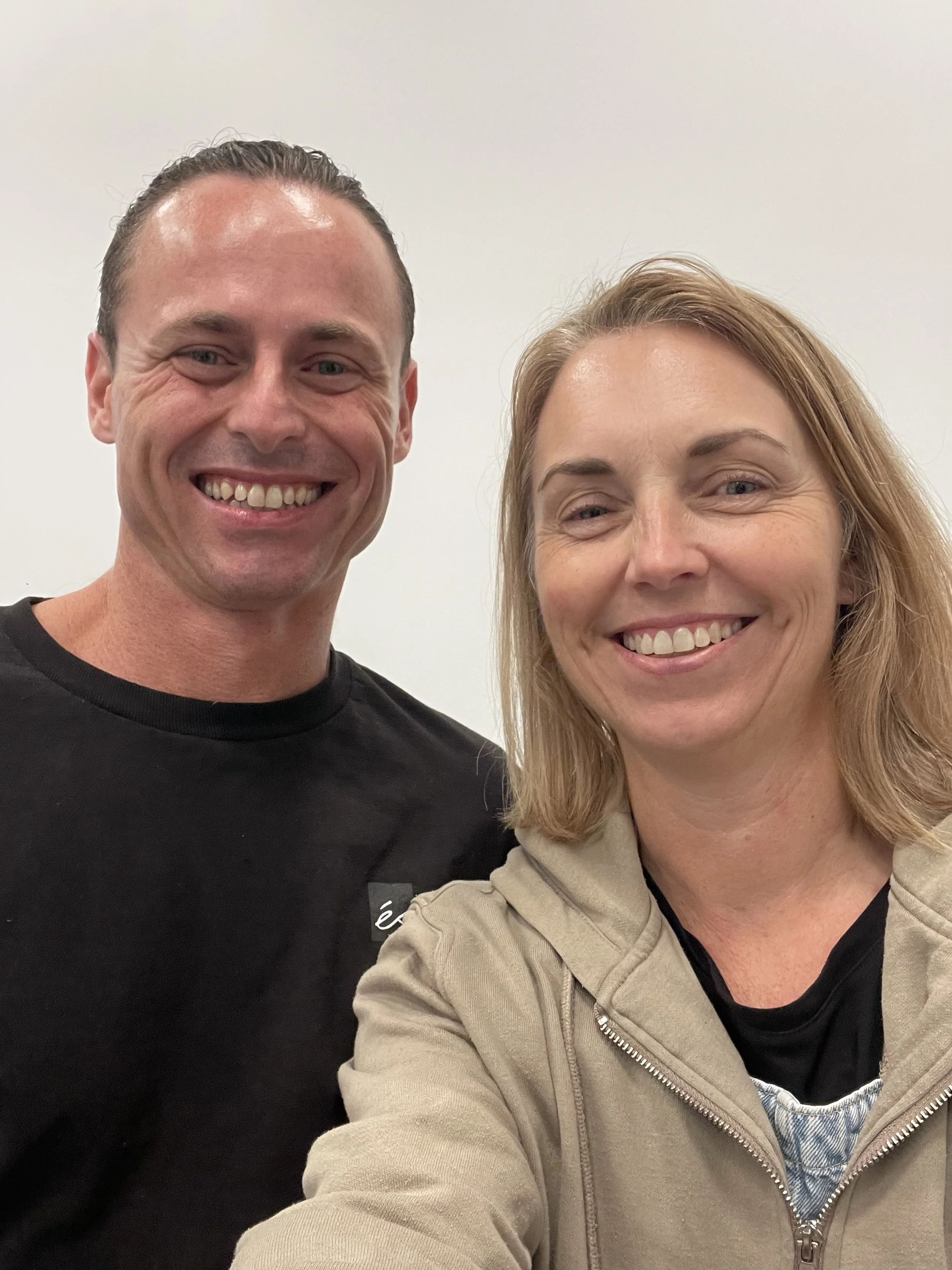
Beauty in the Blackness with Jennifer Allnutt
‘Beauty brings us closer to the sacred and helps us recognise the divine within ourselves.’
‘Beauty brings us closer to the sacred and helps us recognise the divine within ourselves.’
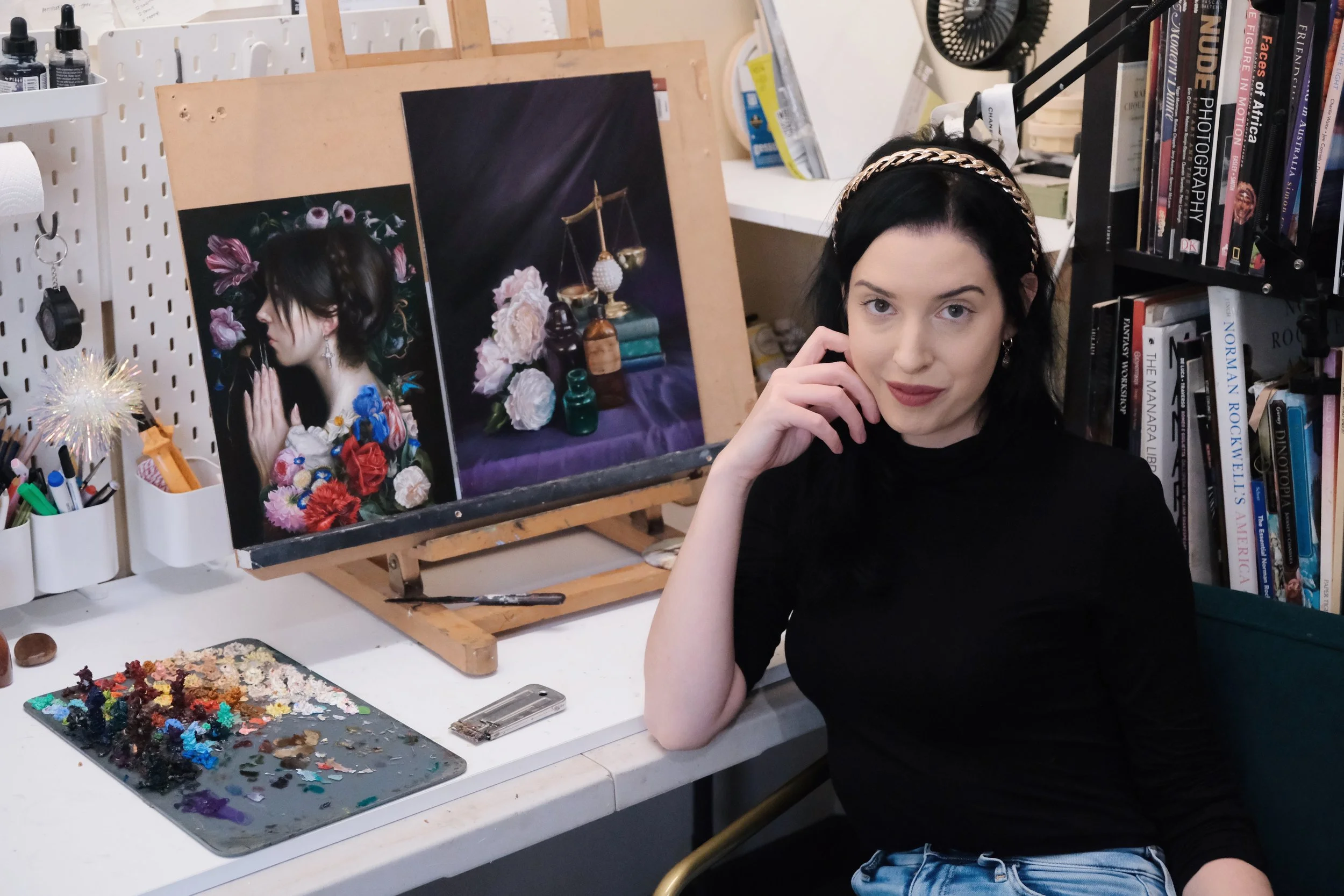
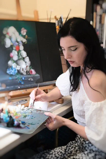
Jennifer Allnutt is a Brisbane based artist who paints floral romantic figures and still life with dark surrealist interventions. Her distinct oil paintings, reminiscent of the Baroque masters; are inspired by personal experiences, mythology, poetry and her love of classical literature. Graduating with a Bachelor Visual Arts (First Class Honours) in 2011, Jennifer’s work has since been featured in publications such as Bored Panda, This Is Colossal and Design Boom. Her art has also graced the walls of renowned galleries as Beinart, Modern Eden Gallery and Corey Helford Gallery. While Jennifer’s work does not fit contemporary conventions of art making, the rate at which her works are being snapped up by collectors show that rich historical traditions of oil painting still connect with audiences today.
In this article Jennifer shares with us how she draws inspiration from the old masters, her interest in memento mori and advice about how to overcome creative blocks.
Background
Jennifer’s introduction to the art world began with her grandfather who was a graphic designer, a skilled draftsman who drew everything by hand. As she grew, so did the world of graphic design and her thoughts about sitting on a computer all day made her reconsider her perceptions about this career. ‘I like doing things with my hands so I guess I sort of started leaning towards more fine art and telling a story.’
During university Jennifer stuck out like a sore thumb, painting traditional subjects inspired by realism and the old masters in a world where everyone else was engaged with conceptual experimental paintings. ‘I was looking at a lot of illustrators like Arthur Rackham and Sir John Tenniel who did ‘Alice in Wonderland.’ This interest in illustration allowed Jennifer to build on her understanding of the narrative through her exploration of symbols and compositions.
Jennifer recalls, ‘I avoided painting (flowers) for a long time. I guess the association I had with flower paintings was it was hobby art. I also had a lot of resentment about making my art too feminine, so I really rejected it for a very long time, even though I loved still life painting.’ It wasn’t until her residency in Queenstown, Tasmania that she back leaned into gothic landscapes, darker palettes and florals from her earlier years in art school.
Influences
‘A Pagan’s Prayer to the Muses’ 2024 Oil on Wood Panel
Many of Jennifer’s early experiences with art were religious, stemming from her Christian schooling. Jennifer states, ‘I'm interested in religion and spirituality but don't really practise anything. It sort of finds its way into my artwork without me trying.’ One work in particular became the catalyst for her award-winning piece, ‘A Pagan’s Prayer to the Muses.’ A print of Albrecht Durer’s ‘Praying Hands’ hung above the art room door during her years in high school, an image which she would walk past countless times that would ruminate in her subconscious for years to come. ‘I just loved the way the hand is all gnarled. It's a really powerful sort of image.’
She recalls, ‘I wanted it [A Pagan’s Prayer to the Muses] to be part of my solo exhibition in March but I didn't get time to finish it. I hit a roadblock. I was really stuck with it so I just put it aside and it didn't make the final cut. Then I came back to it after this solo and really looked at it and played around with it. I just kept trying different backgrounds. I painted the skin on the face and hands so many times to get it right and then many layers. I really feared that it would be one of those pieces that would be facing the wall for years and years and would never get done. I think artists have to have a bit of time to breathe with their artwork to really think about it and contemplate it and find a way to finish it.’ In 2024 she entered this piece in the highly acclaimed ‘Lethbridge 20000 Small Scale Art Prize’ and to her surprise it was awarded first place.
‘Relique’ 2024 Oils on Aluminium Composite Panel 30 × 30cm
Symbolism
‘The Heart’ 2021 (Cover for ‘Please Stop Trying to Leave Me’)
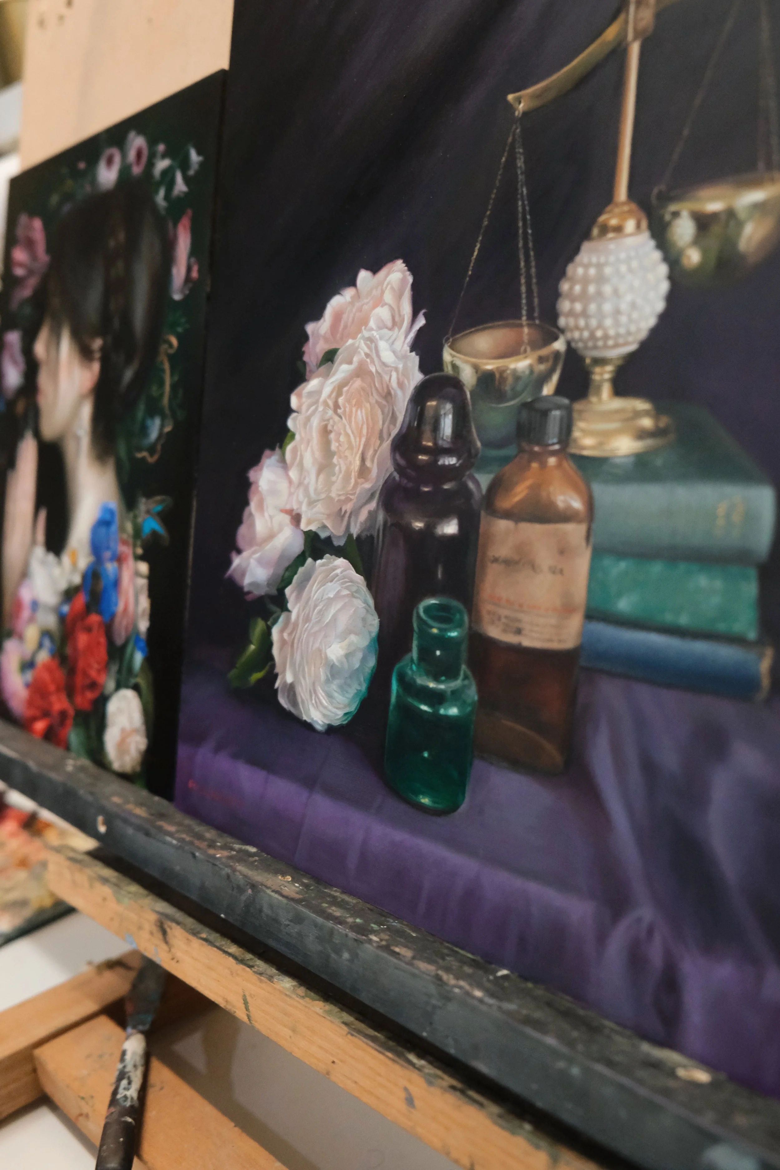
Much of Jennifer’s work incorporates aspects of memento mori, a Latin phrase that means, ‘remember you must die’. Within this genre artists utilise symbols connected with death. Skulls or blown out candles are often frequented objects of this genre. ‘I look at artworks that have these sort of themes and it doesn’t make me feel sad about dying, it makes me feel grateful. It gives me a bit of clarity, it makes life meaningful. I know a lot of people do find it morbid but I think it's sort of illuminating because there can be a beauty in that you are taking every day as it comes and being grateful for those things.’
Jennifer’s choice of symbolism is also inspired by her personal life. One work, ‘The Heart’ (2021, oils on ACM, 30x30cm) was selected by Penguin Random House for the cover of ‘Please Stop Trying to Leave Me’ by Alana Saab.
‘I started making the artwork when I broke up with my second boyfriend. Now I look at that work and I think the relationship was over but I didn't realise it. One eye is sort of looking at the viewer and the other one sort of looks away. The title of the novel is ‘Please Stop Trying to Leave Me.’ It's funny (cruel irony) that I left my partner at the time when I was making it. I showed it at the Corey Helford Gallery as part of their ‘Art Collector Starter Kit’, an annual exhibition of small works. The guy who bought it actually is a heart surgeon which is quite interesting. I think it must have meant something to him.’
Studio Processes
‘Oubliette’ 2024 Oils on Custom Wood Panel Arch 58 × 36cm
Overcoming Creative Blocks
Jennifer credits her ability to overcome creative blocks by nurturing her curiosity. ‘The biggest thing for an artist is curiosity, just constantly learning and seeking out information for your painting, figuring out what your interests are and then leaning into that.’ She spends 50% of her time developing the work and 50% engaging in activities that promote curiosity; whether that be reading, watching a film, visiting an art gallery, taking a workshop or trying a new medium. Jennifer collects and documents these experiences in her journal. “If I ever do feel like I'm stuck I just have a flick through my journal and I'm like, ‘Oh that's a great idea!’ Then you can expand on it and make a painting from there. It is particularly helpful if you're forgetful like I am.” She treats her journal like a scrapbook, an inspiration book that includes printed images, lists of her favourite artists and her written thoughts about what she likes, which she later develops into a narrative for her paintings.
Sourcing References
Jennifer is an avid gardener and it is this process of gardening that feeds her painting process. ‘I have a small garden because I've been moving around these past couple years but I've always had a lot of indoor plants. I think the garden is just something nice to do before you start your day. It's a calming kind of thing and I think it really brings me a lot of joy. I love watching things grow, seeing the life cycle of things.’
‘Spectre (Requiem for Ophelia)’ Oil on Wood Panel 2020 46 × 60cm
‘I buy a lot of flowers and I photograph them. I'm very traditional, I guess, in some respects. I don't do any digital stuff. I keep visual copies so my technique is generally a collaging sort of method. I do the big flowers first and then collage the rest. It's very intuitive. I really like the intuitive process because it gives me a chance to make changes on the fly. I kind of feel like that's the magic when we make changes on the fly. Things come out of your unconscious and find their way into your work.’ Similar to 17th century artists who would do studies of flowers in season and transfer them to a larger painting, Jennifer takes photos of seasonal flowers throughout the year, sketching and then combining it into the final piece. She compares the process of collaging references to doing surgery.
Temperature
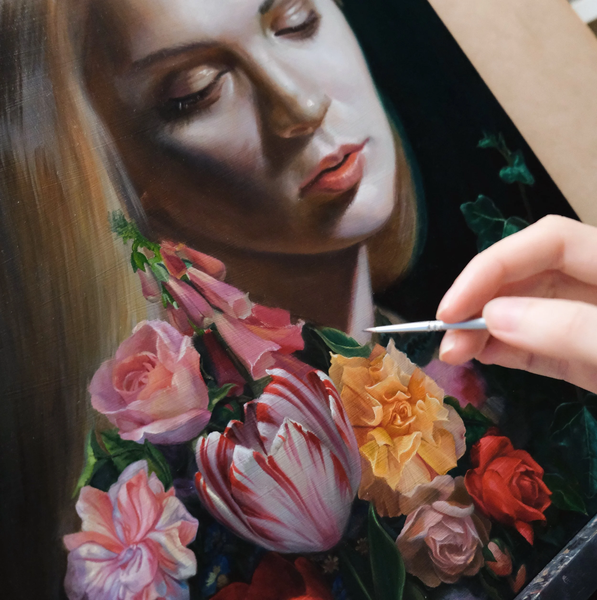
‘Temperature can be something you can really manipulate to create realism. I often paint cool highlights so if I'm doing a portrait the colours on the skin will be fairly cool as a way to create contrast. I like to make my shadows very warm, like warm brown. I add blues into my skin and greens in the highlights, maybe not the centre of the face as it is warm naturally but the chin and forehead will have cool highlights. I really love pale skin. I love painting almost translucent skin when you can see your veins. One of my favourite artists is Rupert Bunny. I love his skin [in his paintings] because if it's in shadow, it's almost like bruised colours.’
Opacity and Transparency
Jennifer alternates between chunky highlights and transparent shadows when she applies her paint. ‘If you get a tube of paint it'll say on the back if it's opaque, transparent or semi-transparent so I'll choose specifically the transparent colours for the shadows to make it fall away, if you know what I mean. The forms in the shadows are unimportant. It's the highlights that are important.’ By applying thick paint to the highlights it creates a natural sort of depth.
‘Kintsugi’ Oil on Aluminium Composite Material 2022 30.5 × 40.8cm
Jennifer’s Choice of Mediums and Brushes
‘I use dreadful brushes, just the cheapest. I get very small brushes like 0 and lower. I prefer synthetic. It is something about the oils that just destroy the brushes. I use the cheapest because I go through them so fast. I know I’m fairly gentle but they tend to fray eventually. I tilt them in a linseed oil bath when I am not painting and then I eventually give them a proper clean in between sessions so I don’t have to wash them every time. I just leave them in there, it seems to make them last a bit longer.’
‘I started out in university days using Art Spectrum but I've slowly transitioned my colours to the more higher end oils. I'm using Michael Harding, I just I love the consistency. I quite like Gamblin and I even have a few tubes of Vasari. I've got a real mix in there. I don't just stick with one brand because of the particular colours I use. For permanent alizarin crimson I only use Winsor and Newton because I really love how they do it. The Rublev brand is quite interesting because they don't use any stabilisers in their paint so it's meant to be more traditional but they're a bit harder to get.
‘The Theory of Equivalent Exchange’ 2020 Oils on Baltic Birch Panel 26 × 26cm
A Guiding Principle
Michelangelo at the age of 80 stated: 'At last my apprenticeship is finished, I am ready to begin.’ Jennifer reflects, 'There is such a truth in that because you’re constantly learning. I haven’t got it all figured out and hopefully fingers crossed I get to 80, I can finish my apprenticeship and move on to the real artwork. That is the beauty of art, it does not matter what stage you are at with painting, you’ll always feel like that. Part of the joy is pushing yourself to a new level.’
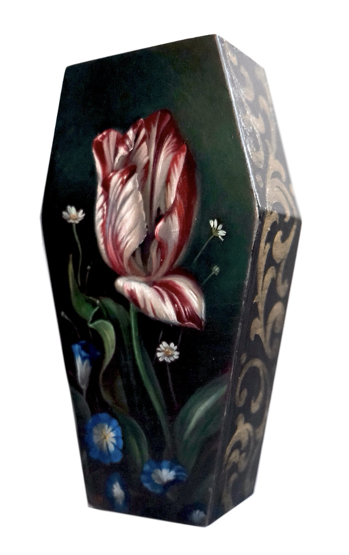
‘Coffin Tulip’ 2024 Oils on Custom Coffin Panel 9.5 × 17.5cm
In the face of AI and contemporary conceptual art Jennifer’s practice continues to value time-honoured traditions of beauty. To quote one of her favourite lines from Dostoevsky’s novel, ‘The Idiot’, ‘Beauty will save the world.’ Jennifer explains, ‘This quote asserts that beauty is truth, truth is beauty and beauty has the power to inspire and elevate humanity. It is the idea that pursuing and appreciating beauty in all things can have a transformative and redemptive influence on individuals. Beauty brings us closer to the sacred and helps us recognise the divine within ourselves.’
Thank you, Jennifer for reminding us that beauty is integral to us as human beings and for championing these values in your work.
For more information and to view a collection of Jennifer’s work, click on the link below:
https://www.jenniferallnutt.com/
Instagram: @jennyallnuttart
Narrative Surrealism & Artistic Identity with Lix North
“Whatever you are doing, do it for you.”
“Whatever you are doing, do it for you.”
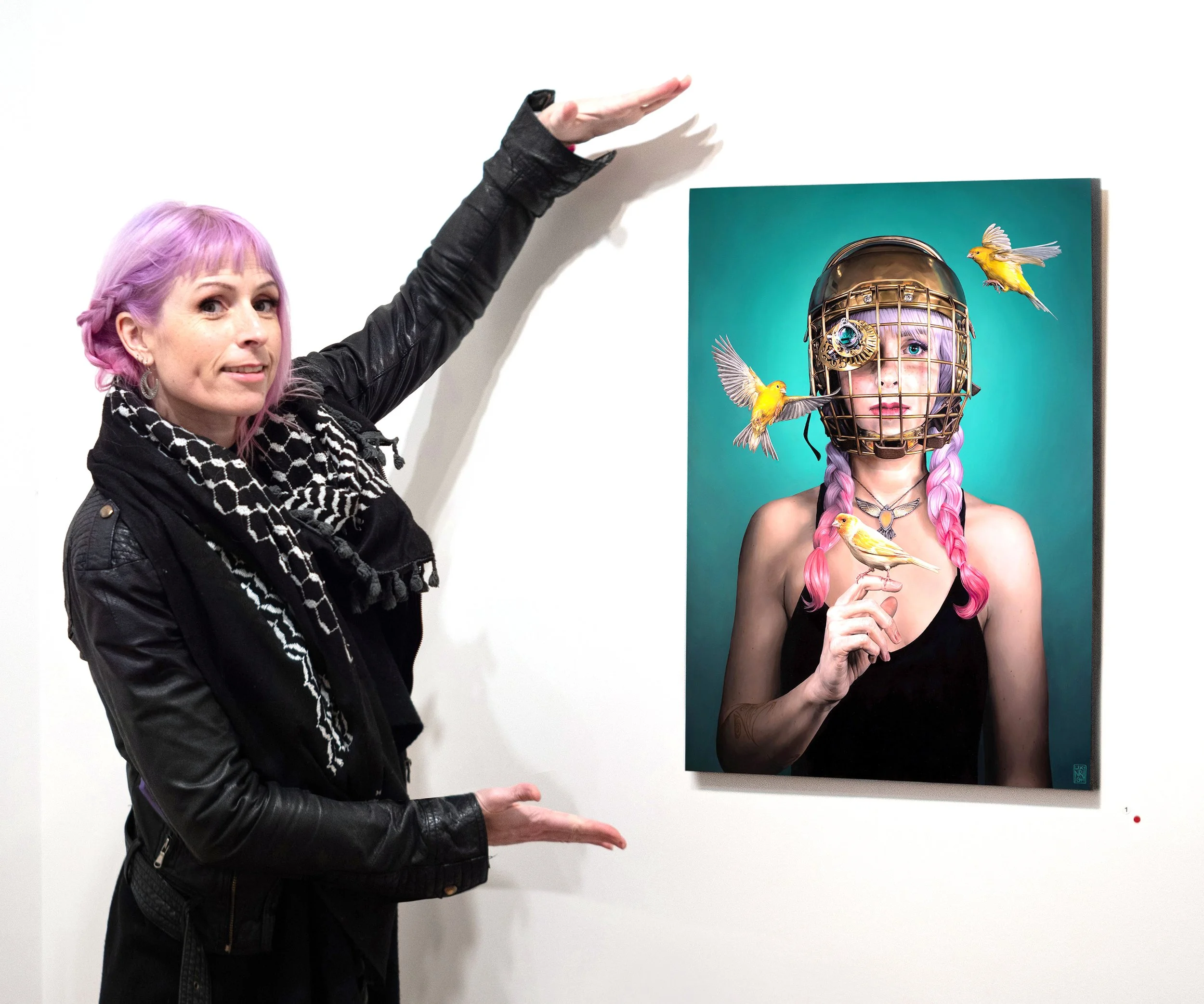
Lix North is a contemporary artist who paints reflections of her internal landscape. Conceptually layered, surreal and often subtly satirical; her work explores the hopeful journey of a physically fragile being in an increasingly imperilled world.
Graduating from NMIT’s School of Visual Arts, Lix’s work initially caught the eye of Auckland Art Fair founder and revered gallerist, Jennifer Buckley, securing a solo show in the respected gallery, Oediopus Rex. She was the youngest artist published in E.M. Caughey’s book, ‘Art New Zealand Today’, and has since been awarded the Art Lovers Australia Prize, Clayton Utz Art Award People’s Choice, a Lethbridge 10,000 Category Award, as well as finalist positions in the Portia Geach Memorial Award and Beautiful Bizarre Magazine Art Prize.
In this article Lix generously shares her advice on finding her artistic identity, how she develops narratives within her surreal compositions and the process of painting on aluminium.
Background
Developing a connection to Australia, Lix settled in Brisbane in 2007. However, it was her childhood growing up in the remote hill country of New Zealand that had a profound influence on her art making. She recalls, “Most of my youth was very isolated. My friends were sheep, sheepdogs, deer and cattle. I did not know I was isolated because that was just my world. It gave me room to explore my imagination. I developed my own stories and things in my head.”
Her Scottish grandmother, one of her primary caregivers, would recite old fashioned stories, draw and sing with her as a child. It was these memories that later became a major catalyst for Lix’s ability to think in ‘story.’
“I feel like I was an artist from a very young age. I had no reference point other than this huge sky and mountains. I was this being that created, whether I was digging holes or building things out of cardboard or drawing, creating was what I did and that sort of never faded. It was always my identity to create. It is still one of my most favourite things in the entire world, to create something from nothing.’”
‘Insurgent’ 2016 Oil on Canvas
Artistic Identity
‘I’m going to paint what I want to paint and everyone else and the world be damned.’
While Lix enjoyed learning about the art world and participating in intellectual debates during her studies, she questioned her role and purpose as an artist.
“When I came out of art school I was painting portraits in a way that I thought might appeal to galleries. I spent probably the first 15 years of my professional career thinking like that and I had a torrid relationship with painting. I quit multiple times. I had multiple years off. I never had any consistency to what I was doing because I was constantly stressed about what I should be doing. I asked myself, ‘Why do I hate it so much? What the hell am I saying?’ Because it has all been said before.”
In 2016 Lix North changed her mindset towards painting. With the her new work ‘Insurgent’, a self-portrait with a steampunk monocular, she made a decision to paint what she wanted. It was this ethos that greatly impacted her sales. Her response to why her work sells,“I think it's because it's authentic. When I started doing just the stuff that meant something to me, that changed everything.”
Lix states, “You can get a lot of unsolicited advice in the art world. Just ignore it, unless you actively want it. I think the best way to find yourself as an artist and find your style is to just put your head down and let the things that make you happy or inspired or excited come out. That's when I started having galleries approach me rather than the other way around.”
It was this self-realisation of painting purely the things that were important to her that led to the emergence of her own style. “I have a very complicated relationship with myself, I've always had trouble with self-confidence and crippling self-doubt. I started photographing myself and painting myself in very specific poses that illustrated a psychological foible of mine.”
‘Stress Fracture’ 2022 Oil on Aluminium
The Narrative
Lix deals daily with health struggles, however she uses these tumultuous experiences as fuel for her paintings. “I have a very active, vigorous and strong mind stuck in a fragile and vulnerable body that lets me down a lot. So I have this psychological battle with my body. It’s my friend and I try to be nice to it but it’s also my nemesis.” The painting, ‘Stress Fracture’ explores this physical turmoil. “Sometimes I feel like just ripping everything apart. Just stop trying to kill me please.”
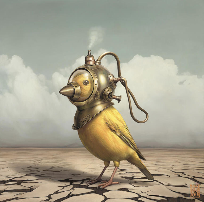
Up until Lix’s recent series, featuring canaries in dystopian environments, her work has been primarily self-portraiture. Lix explains, “Each one deals with a unique aspect of my struggles while also mirroring society’s or the planet’s struggles. There is always a complex interplay between a sense of vulnerability or fragility and a sense of strength and freedom. It is a complex psychological battle between the reality and what you are facing and the potential of what you can do despite that. Something I think about, as much as my all-pervasive health issues, is the state of the world and what we're doing to it. It really stresses me out. There is not a lot you can do about it as an individual but I do feel like if somebody looks at one of my paintings and thinks about what I am trying to say, maybe that makes a difference.”
Studio Processes
‘Rara Avis’ 2023 Oil on Aluminium
How to Photograph Yourself
Lix has been a professional photographer for the past twenty five years. She generously shares her experience when capturing her self-portraits. “A huge part of my aesthetic is influenced by my work with photography.” Early on when Lix first started to take self-portrait references with an old Canon film SLR she used to “set a self-timer and I just let it take lots of shots.” Two decades later her process and equipment has evolved a great deal. “Now I use a Panasonic Lumix G9 which is unbelievably awesome. The display on the back of the camera swings out and pivots around so that you can actually see yourself when you're looking down the lens. I can plug an HDMI cable in o the second screen I have mounted above my studio computer. I hook that up and I can see a huge version of what the camera sees. That’s how you get around seeing your framing.”
Lighting
“I've got a lot of softboxes which are like big tents made of nylon with a semi opaque white nylon front. You put your flash inside and it fires out a diffuse burst of light. I have two of those and a beauty dish, which is like a big round bowl painted white inside. The flash goes inside that bowl and it’s got a little round plate that the flash bounces off and then light disperses around the bowl and out. It creates really nice lighting on the skin and face.”
“I also make weird things that I can put flashes inside. I have this old mailing tube I painted white on the inside and black on the outside. I can shove the flash in one end and the other end has a plastic lid with a little slit cut out like a letterbox. When the flash fires there’s this slash of light, which is really cool if you want to do something dramatic.”
‘An Elegant Solution’ 2022 Oil on Aluminium
Pre-production
“I get really anxious when I paint if I don’t have everything the way I want it before I start. All the detail is done in my mind and in pre-production. I take all my photos, find all my other little references and put it all together on the computer. I then take that image, colour grade it, then I'll put it on my iPad and draw into it in Procreate to tweak things. By the time I’m actually painting I just get to listen to my audiobook, relax and paint by numbers.”
“Often when I think of something that’s part of the story I want to tell, I want to make it first so I can see all the way round it, so I can know it. So, either I 3D design it or put it together with found objects, modelling clay or appropriated stuff. It is an act of familiarising an idea by making the intangible, tangible. Often when a story or idea comes to mind it is not going to be just one painting. If I feel like if I make something that’s going to be a key element in those stories, I will reuse it. Because photography is such a big part of it for me, creating those scenes and getting the lighting the way I want.”
Solo Exhibition Beinart Gallery ‘Gilded Cage’ 2022 Oil on Aluminium
Painting on Aluminium
The aluminium surface Lix paints on is called ‘ACM’ or ‘ Aluminium Composite Material’. This is made up of two thin sheets of coated aluminium with a layer of polyethylene material sandwiched in the middle. It’s a product initially designed for sign-writing printing and it has a very smooth surface that is tough and slightly flexible. There will typically be at least one aluminium side with a thick coating designed for printing. Some more expensive brands have that thicker coating on both sides. Either way, it’s always the side with the thicker shiny coating that’s ideal for painting. As a fine art substrate it’s extremely inert and has no issues with humidity, mould or warping. Gesso isn’t necessary and makes no difference to paint adhesion. Lix simply begins with a very light hand-sand using 1200 grit sandpaper. She’s found this is all that’s needed to optimise adhesion. The only downside she finds painting on aluminium, due to being synthetic, is that’s it’s slightly static so it attracts dust very easily. However, the level of detail that can be achieved on this substrate and the affordability of this material, compared to other more traditional options, far outweighs any negatives.
‘Navigator’ 2021 Oil on Aluminium
Framing Aluminium Paintings
Lix has used two different mounting methods over almost a decade of painting on aluminium. The first used a special metal epoxy called ‘J.B. Weld’ to glue right-angle aluminium extrusion around all sides on the back of the panel, with the rear coating sanded back to expose the metal first, for optimum adhesion. From the front this method mimics the appearance of a seamless stretched canvas edge. These edges can be painted, like one might paint stretched canvas edges, to enhance this illusion.
Her second and current mounting system, which can accomodate the addition of a float frame, involves affixing strips of plywood to the back of the aluminium panel using Liquid Nails. Float frame mounts can then easily be screwed into the plywood backing of the finished painting.
Sourcing and Cutting Aluminium
There are sometimes pre-cut aluminium panel pieces available at art supply stores but Lix recommends sourcing ACM from sign-writing or construction industry suppliers as a much more economic option. To cut her aluminium panels Lix uses a good ruler, a table edge and a craft knife, preferably with carbide blades (available from most hardware stores). She marks her line, scores it with the knife about ten times until she gets through the top surface of the aluminium. Then it’s placed on the edge of a table and with a hand on either side of the score line and weight is applied until the polyethylene middle layer snaps. The remaining layer of aluminium will then detach easy with just a little hinging action.
‘Sentinel’ 2024 Oil on Aluminium
Lix’s Choice of Mediums
‘Avant-Garde’ 2024 Oil on Aluminium
Art Spectrum Oil Paints Lix’s preferred brand due to their quality and innovation without sacrificing affordability. Many unique custom Australian-inspired colours in their range. Excellent customer service.
Winsor and Newton Artists’ Oil Colour (for rare colours).
Bismuth Yellow is a brilliant opaque yellow that is hard to source from other brands. It’s Lix’s choice for her omnipresent canary avatars. Its extraordinary level of opacity typically only requires one coat. She often uses it in tandem with Art Spectrum’s Spectrum Orange when rendering vibrant feather variegations.Archival Oils Odourless Lean is an alkyd based fast-drying medium for oil paint. Lix pours a little into a bottle cap beside her palette and works a drop of it into every colour she mixes as she goes. Using this method her paint typically dries overnight and can be safely worked over the next day. As the name states, it is genuinely odourless and safe for those with sensitivities or those working in shared environments.
National Art Materials Retouch Varnish (spray).
Lix swears by this as the only varnish she trusts for fail-safe varnishing success. Designed for use as a working varnish, it’s able to be sprayed between layers of touch-dry oil paint to deepen colours and blacks revealing accurate tonality as an artist works. Lix also uses multiple layers as a finishing varnish due to it’s ability to ‘play nicely’ over any brand of oil or mix of mediums. It gives a beautiful, consistent satin lustre to new barely touch-dry works and equally can bring life back to an old work that’s been in storage for years.
‘Early Warning System’ 2024 Oil on Aluminium
A Guiding Principle
Lix believes “Whatever you are doing, do it for you. Whatever concepts you’re wishing to express, express it because it means something to you and because you have something to say. I just think things start to go right for you when you have something super authentic to say without external noise getting in the way.”
Thank you Lix, for your heartfelt advice on finding your true artistic voice. I was inspired by how you shared your vulnerabilities and use them as a strength in your art-making.
To view a complete folio of Lix North’s work please click on the website link below:
Presenting your Work Professionally with Carla Grace
“We have a whole new generation of collectors coming up out of the woodwork. They are interested in so much more than just the painting or the awards or the status of the artist. It’s so much more transparent and personal, that it's actually very refreshing.”
“We have a whole new generation of collectors coming up out of the woodwork. They are interested in so much more than just the painting or the awards or the status of the artist. It’s so much more transparent and personal, that it's actually very refreshing.”
Carla Grace is a South African born artist presently living in South Australia with her two young children and husband. She works from her home studio creating paintings that push the boundaries of realistic wildlife painting. Since going full time in her art career in 2016 as a self-represented artist, Carla has had her art featured worldwide. She has sold work in auctions in support of wildlife conservation efforts while also launching a thriving online business where she openly shares her expertise in painting within her art community. Carla has been generous in sharing her knowledge about how an artist can actively present their own work in a professional manner both online and in person.
Her attention to detail, both within her paintings and her business, has set a bar for which many artists could aspire. From my recorded interview, Carla spoke so thoughtfully about the fundamentals of good art practice that I have chosen to include her thoughts and words, rather than my own in this article. Enjoy.
Self-Representation as a Visual Artist
The cornerstone for the success of sales comes down to branding and marketing. I am very proactive in my business and how I evolve. I've grown up in 3rd world countries. I'm very used to, first of all, not having everything, being able to do without and making a plan to do it myself. I am more than happy to work with a gallery. I have trialled galleries in the past but have not found they can sell my work more or better than what I can. If I am not getting value for money, then I can’t see the reason why I would use their service. I research what I need to know.
Art is very personal. When I create my work, I am very transparent and show the whole process. Often galleries are not, they are very closed off. We have a whole new generation of collectors coming up out of the woodwork. They are interested in so much more than just the painting or the awards or the status of the artist. It’s so much more transparent and personal, that it's actually very refreshing.
How to Present your Work Professionally
Consistent Branding
If you want people to view your product as quality, you need to create quality content and represent your art in the best possible way so consistency is key. If you want people to associate value with your brand then you need to portray it as valuable, so make sure that your footage is good quality that you're using the right light and that you've taken care to create a little bit of order. The rest of the studio can be a shambles but what people see needs to portray what you want them to believe about your work. Basically, if you look at your footage and you think, ‘Oh that is shit’, probably other people are thinking that too.
The level of expectation is much higher now for content curators than it used to be. People will appreciate content if the actual thing that you're showing them is really good and they'll dismiss the errors in editing and the bad audio if they are seeing something that is truly valuable to them. However, if you want them to see your work as valuable, if you want them to see what you're creating is beautiful, it needs to be created in a beautiful way for the video, not just the artwork.
My branding has changed over the years. I have found that tweaking a few things along the way to align with the look of my work and who I am, has created a genuine and authentic business. People will associate what they see with what they expect to feel when dealing with the brand.
Strong Reference Images
I try and use my own photographs wherever I can. If this isn't possible or something that I'm just not able to do myself, I will then email photographers directly. I jump online and I usually search royalty free image sites. I will email the photographer directly rather than using the royalty free sites licencing plans because they can often be quite confusing and expensive. I contact the photographer directly, usually they're actually very happy to be involved and credited. I write an email stating that I would love to use this specific photograph and then I attach a screenshot to the emails that show exactly which one. I just say, ‘I love your photograph, I love your work and it's captured a vision that I have for a painting’. I explain the vision and then I explain what my basic sales are, what I plan on doing with the painting when I’m finished. I ask, ‘How much do you charge?’ I always leave it up to them to set their price. Usually, it's free and they just want to be credited. If they set their price, it usually ranges from $50 to $200. An email trail is enough to show an agreement between myself and the photographer.
Creating Quality Footage
When creating really good quality footage, it's not always down to the room that you've got. You can do a lot with just a wall behind you, using a few props to break up the blankness. There's a whole list of things that have to be consistent throughout the entire video. For instance, I need to be wearing the same thing from the start to the end of the video.
Cameras and Lenses
To capture the footage, I use a Canon EOS 5D Mark IV. I've had to do a lot of research on the lenses because the lens makes a huge difference to the image and the quality of the actual footage that you're creating. I love the soft-focus background effect. I don't like to use a lot of filters or even any heavy editing. I found that a 50-millimetre fixed focal lens has been the best, but you need a bit of space because they are a little bit closer. I've just had to figure out along the way how many cameras I need to capture all the different angles because I'm not able to get up to move this camera every single time, like you would if you had someone else filming.
Every 30 minutes I must get up and start the cameras again because they are photography cameras and don't roll endlessly, they time out every 30 minutes. I've got my little timer set on my phone that dings every 30 minutes so that it doesn't turn off before I finish saying whatever I'm saying. I have one camera facing me, one camera on the pallet, one camera that shows the whole painting and then one camera that I zoom into the area that I'm working on so that the people can see the detail and the brush strokes. They must be situated in such a way that they're not in all the shots.
Lighting
I found a Wall Mounted Scissor Boom for studio lighting that has the right threads that go onto the tripod heads for the cameras. I don't usually work with natural light because it changes so much and there's usually always a colour reflected in that light. I've used softbox lights now for years and they've been the best, not only for filming but also for photographing. I use daylight lightbulbs. The light reading on the daylight bulb is quite warm at 6000 Kelvin and usually I set that at 5700. It comes out well in terms of replicating the most natural light.
Artist Portfolio
If you are using a physical portfolio, make sure to get the images of your paintings clearly printed off by a printing company so that the colour and quality are the best representation of your paintings. Display one painting per page with a brief artist statement about each painting. Also include a short essay on your vision as an artist, as well as your achievements.
In an online portfolio, you can mimic the same format by using a gallery grid format where viewers can see your paintings as smaller cropped thumbnails. They can then click on any of the images to view them individually, with access to the short artist statement too. Remember, simplicity is best, making things clear and easy to navigate.
Essentials of a Professional Artist’s Website
Simplicity is key, easy to navigate. Less is more with websites. Think of it as a central heart to all the other outlets of your business.
Social Media Links: Your social media needs to link to your website. Your blogs, store and news should all be accessible from your website and should point people to your website. It is the consistent aspect of your business. However, if you need to change it to make it more streamline or aligned with your brand then it’s essential to do that too.
Gallery of Best Works: I recommend having a gallery of your best works, not all your work, just the pieces you are most proud of and that are a true representation of your abilities and your vision.
Bio: You need a bio where you tell your visitors about yourself, what you have achieved and your goals.
Shop: A shop is where people can see what work you have available and other items.
Landing Page: A landing page for any other aspect of your business is essential. For me it is a replica of my tutorial platform Home Page, making it accessible in my website as well as linking the two elements together.
Studio Tips
Time Saving Strategies for Painting
I avoid overworking or overthinking the painting because as soon as you get stuck on a section, that's where the ‘time sponge’ comes out. If you obsess over getting the detail right, eventually it has been three or four hours, and you are still stuck on the same section. If I start having to reapply and fuss, I just move on because it ends up being not as bad as you think. I found that if I just apply the first layer as much as possible, work over the whole painting and then start focusing on the details, it comes together much quicker. When I'm teaching my tutorials, I don't just look at this one area that we are focusing on. I apply it where I see it over the whole painting so that I am not having to come back and re-evaluate the colours as I’m going.
Time Saving Equipment
My Redgrass Everlasting Wet Palette is the best tool that I have purchased because it keeps my paint wet for so long. It saves me time and money when mixing colour. Everlasting Palettes are more compact and fits in my freezer. They have a glass tray insert. You can either use the sponge and paper for acrylic or you can use the glass which is a neutral grey colour for your oils. The Stay-wet Palette lids tend to rip and can be really hard to seal so Everlasting Palettes have been a better long-term choice.
Carla’s Choice of Mediums
Golden Open Acrylics (Very high pigment load and one of the best in the industry)
Matisse Derivan Acrylic
Maimeri Puro Oils (This is my choice of oils. They don't require much, if any, medium so you don't need to consider rules of fat over lean using this brand of oils.)
Michael Harding Oils (Quite thick so therefore more medium is required and therefore consideration of fat over lean rules apply with these paints).
Carla’s Colour Palette
Burnt Sienna
Raw Sienna
Burnt Umber
Raw Umber
Paynes Grey
Prussian Blue
Alizarin Crimson
Yellow Ochre
Golden Ochre
Titanium White
Thank you, Carla, for your advice on developing a professional practice. The initiative you have shown in both your studio and your business is testament to the fact that artists can be independent in their approach and still have success. I wanted to leave you with a quote from Carla that sums it up nicely.
‘Your own education is vital to your growth. Not formal education, but the constant pursuit of knowledge. Never get comfortable in your current state, always look for new ways to learn things, study new trends, do a course every now and again to strengthen the areas you are weakest in.’
To view Carla’s work or for more information about her tutorials and courses click on the link below:
The Healing Power of Sketchbooks with Deb Mostert
‘I feel I am increasingly being cast in the light of a sketch book artist. If I had to give up something, I could lose everything except my practice of drawing in a sketchbook. Making small art is not fashionable but for my own personal journey it is way more important. You can do it anywhere with anything.’
‘I feel I am increasingly being cast in the light of a sketch book artist. If I had to give up something, I could lose everything except my practice of drawing in a sketchbook. Making small art is not fashionable but for my own personal journey it is way more important. You can do it anywhere with anything.’
Award winning artist, Deb Mostert, has created over 100 sketch books over the past 20 years which she has shared with students and in museum exhibitions. While her art practice spans a fourty year career, she has only drawn regularly with a sketchbook for the past twenty. Her only regret is that she wished she had started using sketchbooks earlier. Her drawings have become smaller over time but are an invaluable chronological record of her art journey. Deb’s contemporary art practice of painting, sculpture and public art are all underpinned by a daily drawing routine developed in her sketchbooks.
Sketchbooks and Wellbeing
‘Carrying it and not just having it (sketchbook) in the studio, it becomes part of your life,’ states Deb. ‘It is amazing what gets revealed when you sit and observe.’
Deb carries a small sketch book with her everywhere, sitting in waiting rooms and on public transport, drawing the people and surroundings that are part of her daily life. For her the ungirding process of keeping a sketchbook creates stability and constancy.
‘I love drawing people on trains as nowadays it seems everyone is heads down on a device, so it is easy to avoid their attention. But sometimes I get noticed. Once I had a lady follow me off the train wanting to see what I had done and to ask for a commission. I have been congratulated by older people for doing something other than devouring content on a phone and even had young kids ask to join in. I draw at concerts and music gigs. Performers love seeing the scribbles I make in the dark while listening to them.’
‘I am more happy in my sketchbook because there is not a perceived expectation that you would have when you produce finished works for a gallery. There is no external critique of it. I use it conceptually to work things out, whether that be for a project for a museum or my own thoughts. When nothing seems to work in the studio, to be able to sit down and do a rubbish drawing, doing something concrete makes me feel better.’ Deb tries not to rip pages out of her diary because they are generally bound but instead works over former drawings she dislikes with gouache. ‘I don’t want to eliminate my progress, which what a mistake is, if I can learn from it. How can I learn from it if I remove all memory of it? I like to see the progress I am making.’
She refers to sketchbooks as a private playground where you can indulge yourself, a selfish endeavour. When asked about her feelings when sharing her books with the public she stated, “It is a bit ‘ouchy’ to share my private thoughts, drawings and writings. It makes me vulnerable, but I don’t want to edit myself. On the whole people are grateful, particularly adults, for sharing these vulnerabilities.’
Deb also reveals that sketchbooks help with her spiritual musings. ‘We live a fast life and slowing down is important. We have lost the capacity to do that. I value the practice of sketching in a spiritual way.’ Deb views sketchbooks as a meditative practice to connect to God but also more specifically to communicate a message of beauty and hope in an age where there is much anxiety. ‘Gratitude is at the core of how I feel when drawing in a sketchbook. So much beauty in our everyday lives to sit and enjoy by drawing. Prayer and meditation seem to be part of it, it feels like contemplation to really observe. I do think observation is a deep form of gratitude.’
Deb’s Tips for Working in a Sketchbook.
Do you have a favourite sketchbook and why?
I enjoy Stillman & Birn and Strathmore, especially their toned paper books, but I'm also willing to try any brand. My only deal breaker is if the paper can't handle my markers and pens without bleeding through. I do prefer paper that will handle a reasonable wash. I carry portrait A5 and A4 sizes as an everyday sketchbook but will sometimes select a landscape format for a travel diary.
What is your choice of media when sketching?
I primarily use pens in my sketchbooks, favouring fountain pens I can refill with my preferred brown or grey inks, but also use biro, brush pens, and markers in both soluble and permanent inks. Combined with a small watercolour kit I made myself and a waterbrush, I can be ready for most situations and it all fits in a small pencil case. The extras like oil pencils, white gel pens and water-soluble coloured pencils float in or out depending on my needs or mood. I have discovered over the years that less is more and too many options weigh you down and paralyse you with choice. I will happily combine my media and mostly draw straight in with ink as I don't often have time to carefully block in with pencil when I am drawing on the run. It's a risk making a hash of an ink drawing but lends some excitement to the practice, and when it works it is a delight to have bold confident lines made in the moment.
What advice would you give someone to get better at observational drawing?
Do tons of it! I have enjoyed many years of drawing from life, and trying to record swiftly the gestures, proportions and form of any and every subject matter. It doesn't matter what you chose to draw, just draw what is in front of you. Carry a small sketchbook around with you with a biro and commit to drawing something, anything for two minutes. It is satisfying when you fill a page with say twelve small boxes with a two minute drawing in each. Not a big commitment but it gives you a buzz, and any drawing you can do on a daily basis will help build the practice.
If you can't see where you are going wrong in your drawing and you want a quick feedback loop then use a photo as reference and lay a transparent version of that same reference over your drawing, occasionally checking that you are on track. Not tracing, but checking your own choices and adjusting.
What is your advice for capturing the likeness of your subject?
If you are drawing quickly in public, then it requires stealth and a reliance on capturing gestures more than anything. Much can be described by gesture. Also, look for shapes - shadow shapes are your friend if the lighting allows it.
If you are setting up a portrait from life or choosing to use photo reference, make sure you pay attention to getting a helpful lighting setup, it makes it easier to see form and shapes if light is showing you the way. There was a reason so many masters set up light to play across a face in certain ways. Look at Rembrandt, in the studio he was in control of the light and relies on form. In the field in his quick sketches he uses gesture.
What are some mistakes you see people make when they draw from life?
If you are keen to be accurately representational, then proportions can be the undoing of many an earnest beginning. I still berate myself for not having checked before investing in heaps of rendering to discover that I was way off. Understanding gesture and movement can save your drawings being stiff and having a sculptors sense of form will enormously improve your capacity to make the optical illusion of a 2D drawing believable. Students sometimes feel too precious about the marks they make which makes erasing mistakes or starting over too difficult, so they flounder on when sometimes the only thing to do is to abandon those marks or change them. It is best to be dispassionate about the marks until you feel confident they are what you want to invest in.
What is the best piece of advice about drawing you have learned from someone else?
After a university education in the conceptual concerns of a fine art practice I was keen to learn in an observational way from nature, so I sought external teachers who could help me. My understanding of shadow shapes and form came many years ago from learning under Scott Breton and drawing from plaster casts which was very old fashioned. I have since added to that by watching and learning from animators, illustrators and young and old masters online. Proko, Jeff Watts, Steve Huston, Glenn Vilppu all taught me gestures and a deeper understanding of structure and form. James Gurney inspires me to paint in my sketchbook. There is so much great tuition on the interweb, and a lot of rubbish to avoid too. Experimenting with low risk in my sketchbook opens up new practice and possibilities.
Thank you, Deb, for your heartfelt advice on developing a sketch book practice. Early in my art career I would regularly sketch for enjoyment in a Visual Diary. Unfortunately, with the demands of gallery exhibitions the act of drawing in a book had fallen by the wayside, viewed as something for which I had no time. After speaking with you, I have definitely seen the value of incorporating sketch books back into my daily life, not just as a record but as a way for me to slow down, be still and observe. I think you said it best, ‘It is private playground where you can indulge yourself.’
If you are interested in learning more about Deb Mostert and viewing her body of work please peruse her website or contact her on the links below.
To view her interactive sketchbook click here: https://heyzine.com/flip-book/a0bbda9449.html#page/1
https://debmostertartist.com.au/
Developing Colour Confidence with Anne Smerdon
‘Be concerned with accurate colour not accurate brushstrokes.’
‘Be concerned with accurate colour not accurate brushstrokes.’
Anne Smerdon is an award-winning Australian artist focused on the complex but often-overlooked minds and personalities of animals, particularly birds. With an extensive knowledge of bird psychology and body language, Anne uses her work to raise awareness and educate others about protecting and caring for our wild and captive birds. In 2016, Anne founded The Artory, an art school that specialises in teaching ordinary people (both kids and adults) how to unlock their creativity and have fun with art.
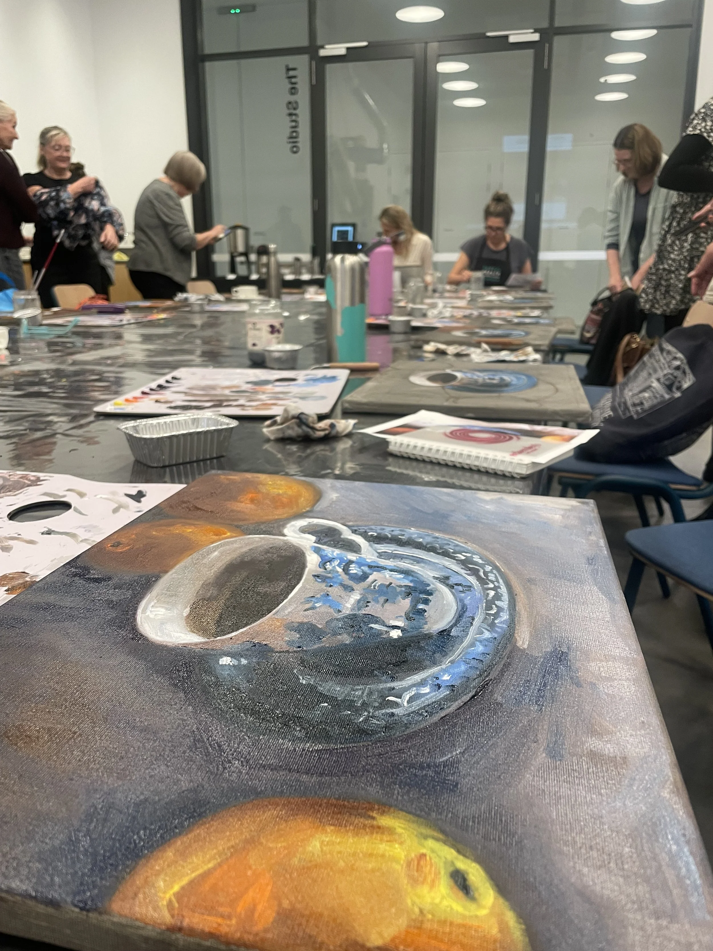
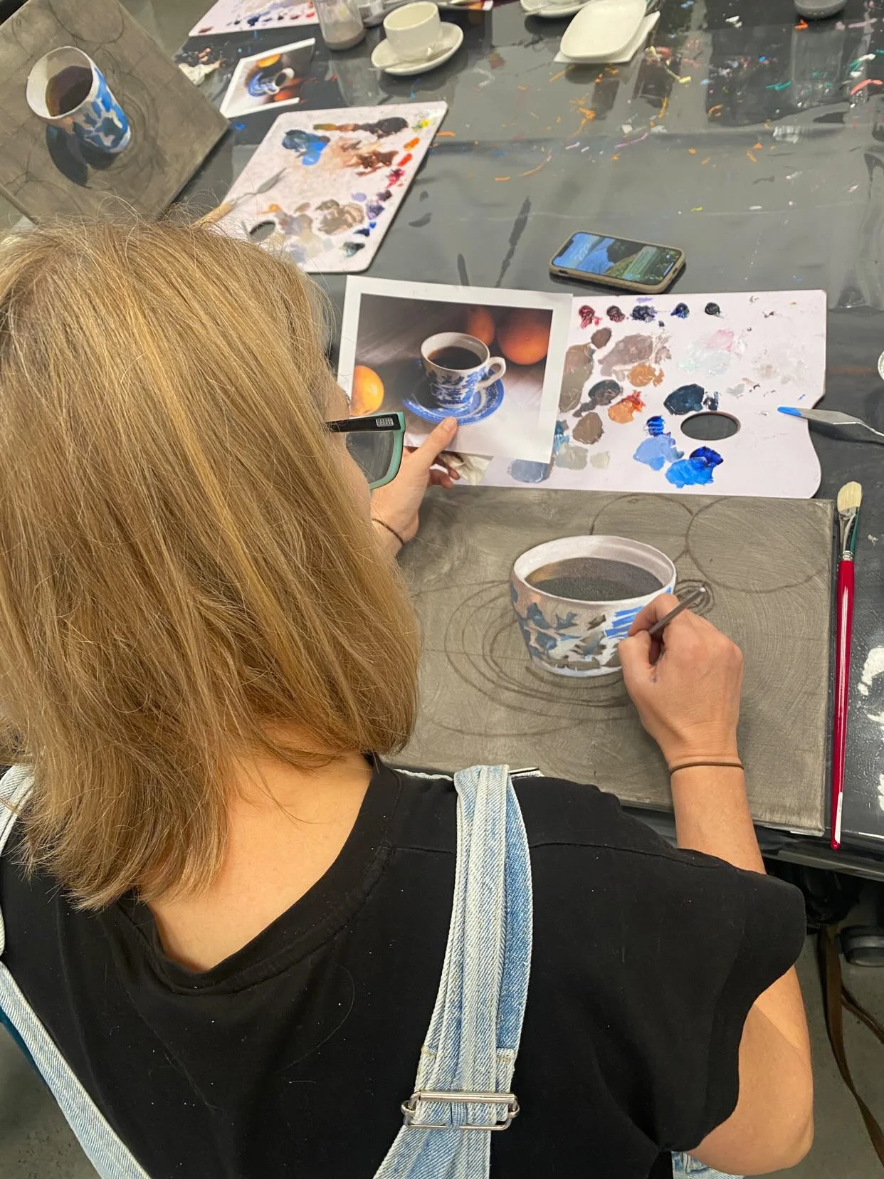
During June, I had the pleasure of attending a workshop by Anne Smerdon, hosted by the HOTA (Home of the Arts). During the workshop Anne stated something profound, ‘Be concerned with accurate colour, not accurate brushstrokes.’ I had previously thought of colour as a secondary element in my painting process. So concerned with the narrative, symbolism, composition and fine detailed brushwork; colour had always been the last element that I had considered when developing a painting. Even though I had been an art educator for over twenty years, never did I consider the degree to which colour could be such a pivotal part of my own painting practice.
Understanding Colour Perception
For years I had struggled to understand why my colours looked so different on the palette to when I painted them on the canvas. Often I would remix and rework a section of a painting several times because the colours did not look accurate. Anne explained that when we put colours on a white canvas it makes the colours look darker because of the contrast. Colours can also seem different dependant upon which colours sit next to each other. So how do we solve this problem when our eyes play visual tricks on us? One solution is toning our canvas first with a neutral colour like a grey. This way our eyes have a mid tone by which to judge each colour. The second solution is when we begin a painting, we start with the darkest and lightest colours in the image so we can measure all future colours according to these. It was remarkable what difference this made when I began to assess my colour mixing and build my painted layers.
Mixing Colours
Anne demonstrated that if you mix your colours with a palette knife and hold it up to your reference you should be able to assess whether it is a perfect match. Be sure to shut one eye when assessing with the palette knife. If the colour blends into the reference then the colour is accurate. While I often paint at night and my lighting is not always the best, this technique has helped immensely. I would encourage you to use a metal palette knife when you work through this process as a white palette knife may affect your visual perception.
Anne talked about chroma which comes from the Greek word ‘khroma’, meaning purity or intensity of colour. This is the most pure form of colour that comes straight out of tube. To dull a colour rather than using black, use the opposite colour on the colour wheel. Greys can also be created by mixing opposite colours plus white. Anne advised to mix the lightest and darkest of each colour first so that these are prepared well in advance of applying the brushstrokes to the canvas.
Another important instruction for colour palette organisation was to work in ‘strings rather than puddles.’ What does this mean you may ask? Anne highlighted that you mix all your original colours or ‘mother colours’ in one line at the top of your palette. From there when darkening or lightening a colour, mix them in one line underneath as to not taint the original mix. It also helps visually so you can compare your colours. I thought this advice was so practical as my palette often ends up in one big hot mess, so disorganised it is difficult to work out where I started. Last night I was tempted to revert to my puddle making approach due to laziness, but I stopped myself. It is important to apply what you have learned in order to develop a better art practice.
Anne’s Colour Palette
During the workshop we used Winsor and Newton’s Winsor student oil range however in Anne’s art practice she uses Langridge oil paints and mediums. They are Australian made and uncompromising in quality. Their paints have a very high pigment loading and are based on contemporary high-saturation colours. Anne told us that a Phathlo Green is more intense and stronger than a Viridian Green so this is her choice of green as it has more impact.
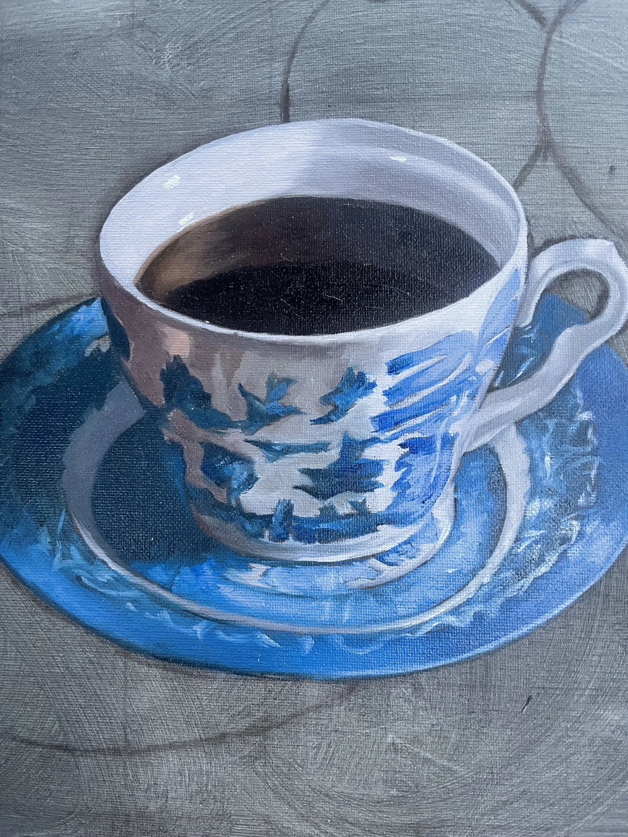
Since I have been recently painting Blue Willow China in my own series of works, I was particularly interested in the choice of colours she uses when painting this subject. For the lighter tones of the china design we mixed Phthalo Blue and Quinacridone Magenta and the for darker areas Phthalo Blue, Transparent Red Oxide (Brown) , Quinacridone Magenta and the slightest smidge of Cadmium Yellow.
Titanium White
Cadmium Yellow PY35
Cadmium Yellow Deep PY35
Transparent Red Oxide PR101
Cadmium Red PR108
Quinacridone Crimson PR19?PR179 (sometimes called Permanent Alizarin)
Quinacridone Magenta PR122
Dioxazine Violet PV23
Phthalo Blue (Red Shade) PB15.1
Phthalo Green (Yellow Shade) PG36
During the workshop students used Archival Oils Odourless Solvent for cleaning brushes and Archival Oils Refined Linseed Oil as their medium. However, Anne uses the Langridge brand of medium and solvent. Apparently Landgridge Solvent 75 is the lowest toxic solvent in the world which is good to know to keep those nasty fumes away.
Thank you, Anne, for your informative workshop on how to approach colour in oil painting. It has definitely impacted the way I develop my colour palette and my perception of how artists can best approach colour application. For someone who is so fixated on details, you are forever going to be one of the artistic voices in my head telling me to, ‘be concerned with accurate colour not accurate brushstrokes.’
If you are interested in perusing Anne’s stunning collection of artworks or would like to hear more about her art classes click on the link below:
Fast Drying Oil Painting with Joel Rea
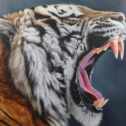
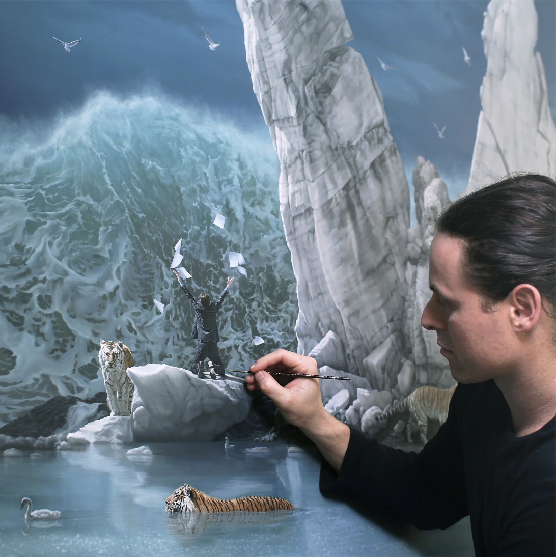
Joel Rea is a highly acclaimed and multi award-winning artist known for his surreal, allegorical paintings. Rea’s oil on canvas works stand somewhere between genres of hyperrealism, photorealism and virtuosic Renaissance realism. He is meticulous in his attention to detail and often spends months mastering the detail in one painting. His imagery frequently depicts: self-portraits; tigers; dogs; sun rays coming through clouds; and destructive waves inspired by the turbulent Australian coastline where he played as a child. This contemporary surrealist painter’s attention to craftsmanship is unmistakable when you view his works in person.
Ever felt a bit lost with oils or find them overwhelming? While I have painted in water based oils and acrylics for some time, I have always felt oils were a little daunting. This was my feeling until recently when I attended a workshop by Joel Rea at the HOTA (Home of the Arts). I wanted to share with you a little of what I have learned in the hope that it will give you the courage to dive into oil painting.
Below are some tips that Joel generously shared in his recent workshop.
Joel’s Tips on Image Preparation
Joel advised to prime your canvas with a mix of gesso and acrylic as a blue- grey coating as this a great mid tone to begin a painting. This process is called ‘toning your canvas’. He prefers to transfer his design using large scale digital prints with transfer paper to avoid distortion, which you might experience when using a projector. This tracing is rubbed back with a soft rag to leave a faint line and can be sprayed with a fixative to avoid smudging. He often redraws details back over his acrylic base if some of the lines disappear in the process. Transfer paper can not only be purchased in black but also white, which is convenient when tracing onto a dark surface. He often places his printed references just above or below the area of his painting to ensure accuracy in his brushwork.
Joel warns when painting from printed references they can be frequently over-saturated so you need to be careful that your colours are accurate otherwise this will adversely affect the colours of your final piece.
He paints his first base coat in acrylic before painting further layers of detail with oils. Joel tends to mute his colours for his base layers and then brings the intensity back up for the highlights to make them look exciting and spontaneous. Using straight white sparingly ensures that the highlights have maximum impact.
Choice of Media
Joel uses a polycotton canvas as it is super smooth and is great for fine detail. When we painted in the workshop, I couldn’t believe how smooth this substrate was, making the blending process so much easier. He staples his canvas to a big piece of wood in order to have a firm background when he paints. This is later removed and then restretched on a frame.
His choice of oils are Winsor and Newton’s Griffin Alkyd. These are fast drying oils which allow you to work quickly when building your layers. He combines this with Liquin for his medium. Liquin can even be brushed over a painting to make it dry quickly. This was a great tip for someone like me who has resorted to a hair dryer when deadlines are looming and I still have a wet painting.
Joel adds liquin on his palette and mixes it with his paint. He uses foil wrapped over a board instead of palette liners or a bare palette to save on cleaning time. To avoid the paints drying quickly he covers all his paints with cling wrap and only mixes small amounts of paint at a time. He reminds us that acrylics always dry a shade darker but oils retain the same colour when dry so it is easier to remix a colour.
The thinning agent Joel uses while painting is Gamlin’s Gamsol Odorless Mineral Spirits which complements the Griffin Alkyd series of fast drying paints. A great tip he gave for cleaning brushes is to use baby oil or mineral oil as it is much kinder to brushes, a great alternative to harsher chemicals.
Colour Palette
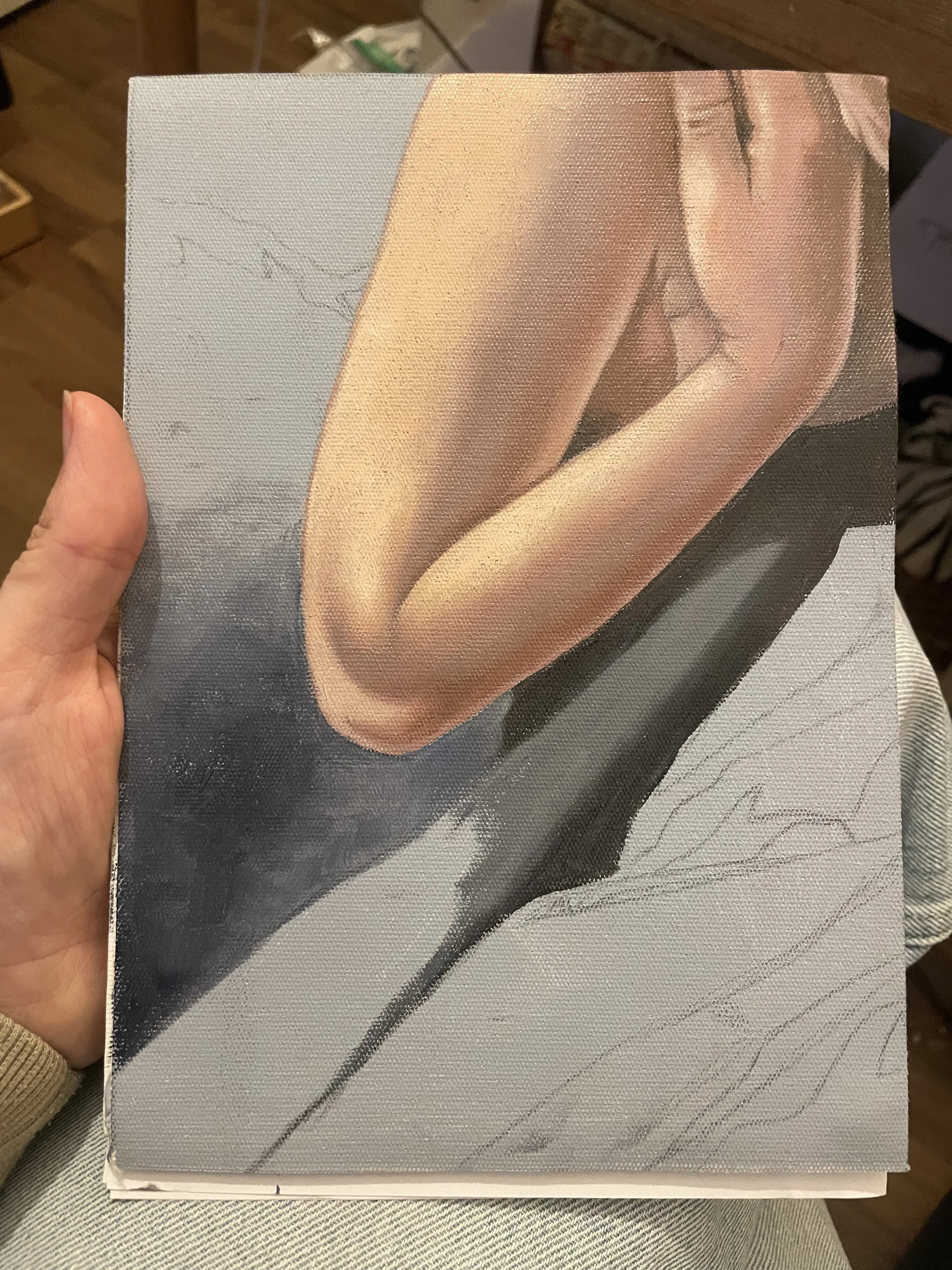
Joel’s choice of colours for creating skin tones are titanium white, naples yellow hue, winsor red rouge winsor and burnt sienna. You can see the outcome of using these colours in the sample painting I created below during the workshop. Payne’s grey is his choice of colour when painting black areas as it avoids creating muddy or dirty hues when mixed with other colours. His colour palette for water includes payne’s grey, titanium white, ultramarine blue and phthalo green.
Joel was a fountain of knowledge when it came to realistic oil painting but also generous in sharing his experience of the business of art. Thank you, Joel, for an informative workshop on how to approach oils in a really fresh way. I can’t wait to apply the process you shared in my own art practice.
If you are interested in viewing more of his work visit his website at https://joelrea.com.au


