
Beauty in the Blackness with Jennifer Allnutt
‘Beauty brings us closer to the sacred and helps us recognise the divine within ourselves.’
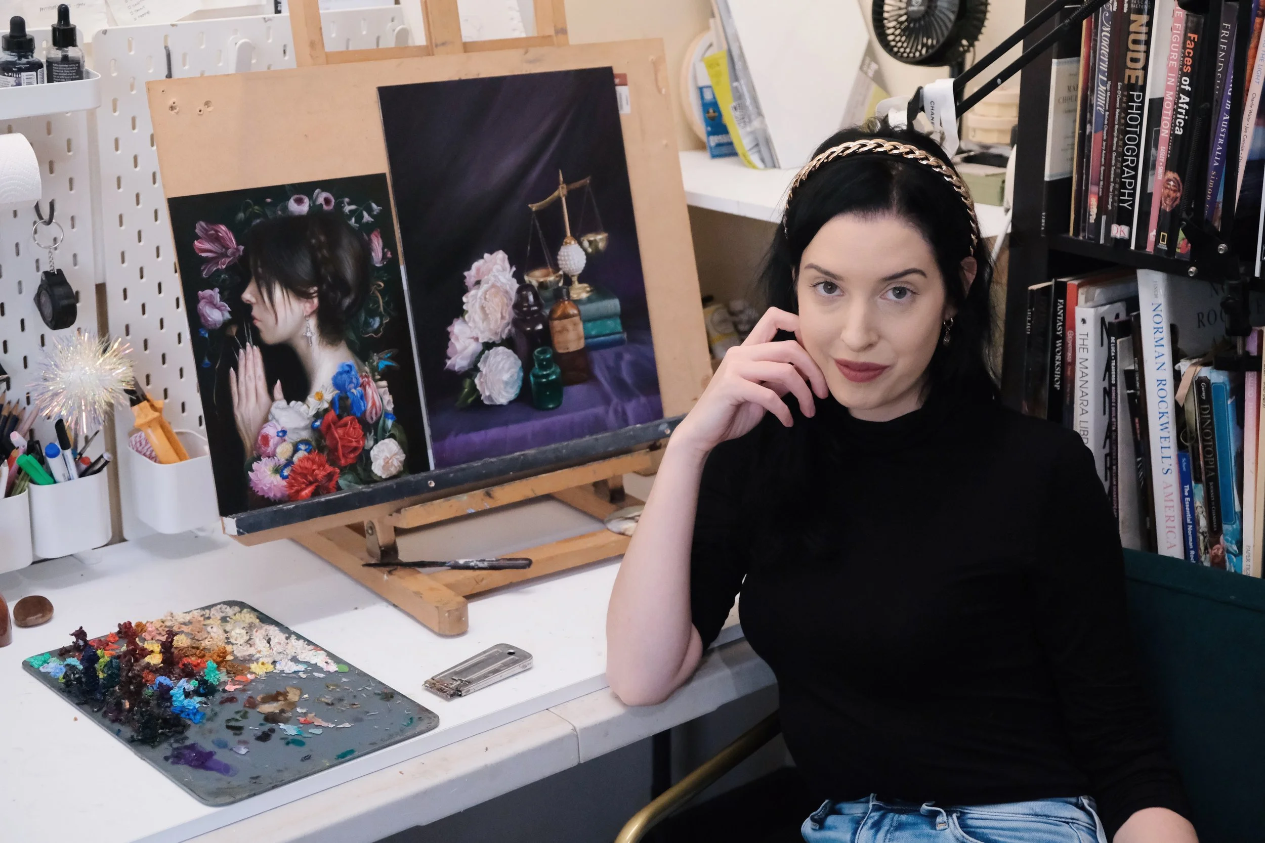
Jennifer Allnutt is a Brisbane based artist who paints floral romantic figures and still life with dark surrealist interventions. Her distinct oil paintings, reminiscent of the Baroque masters; are inspired by personal experiences, mythology, poetry and her love of classical literature. Graduating with a Bachelor Visual Arts (First Class Honours) in 2011, Jennifer’s work has since been featured in publications such as Bored Panda, This Is Colossal and Design Boom. Her art has also graced the walls of renowned galleries as Beinart, Modern Eden Gallery and Corey Helford Gallery. While Jennifer’s work does not fit contemporary conventions of art making, the rate at which her works are being snapped up by collectors show that rich historical traditions of oil painting still connect with audiences today.
In this article Jennifer shares with us how she draws inspiration from the old masters, her interest in memento mori and advice about how to overcome creative blocks.
Background
Jennifer’s introduction to the art world began with her grandfather who was a graphic designer, a skilled draftsman who drew everything by hand. As she grew, so did the world of graphic design and her thoughts about sitting on a computer all day made her reconsider her perceptions about this career. ‘I like doing things with my hands so I guess I sort of started leaning towards more fine art and telling a story.’
During university Jennifer stuck out like a sore thumb, painting traditional subjects inspired by realism and the old masters in a world where everyone else was engaged with conceptual experimental paintings. ‘I was looking at a lot of illustrators like Arthur Rackham and Sir John Tenniel who did ‘Alice in Wonderland.’ This interest in illustration allowed Jennifer to build on her understanding of the narrative through her exploration of symbols and compositions.
Jennifer recalls, ‘I avoided painting (flowers) for a long time. I guess the association I had with flower paintings was it was hobby art. I also had a lot of resentment about making my art too feminine, so I really rejected it for a very long time, even though I loved still life painting.’ It wasn’t until her residency in Queenstown, Tasmania that she back leaned into gothic landscapes, darker palettes and florals from her earlier years in art school.
Influences

‘A Pagan’s Prayer to the Muses’ 2024 Oil on Wood Panel
Many of Jennifer’s early experiences with art were religious, stemming from her Christian schooling. Jennifer states, ‘I'm interested in religion and spirituality but don't really practise anything. It sort of finds its way into my artwork without me trying.’ One work in particular became the catalyst for her award-winning piece, ‘A Pagan’s Prayer to the Muses.’ A print of Albrecht Durer’s ‘Praying Hands’ hung above the art room door during her years in high school, an image which she would walk past countless times that would ruminate in her subconscious for years to come. ‘I just loved the way the hand is all gnarled. It's a really powerful sort of image.’
She recalls, ‘I wanted it [A Pagan’s Prayer to the Muses] to be part of my solo exhibition in March but I didn't get time to finish it. I hit a roadblock. I was really stuck with it so I just put it aside and it didn't make the final cut. Then I came back to it after this solo and really looked at it and played around with it. I just kept trying different backgrounds. I painted the skin on the face and hands so many times to get it right and then many layers. I really feared that it would be one of those pieces that would be facing the wall for years and years and would never get done. I think artists have to have a bit of time to breathe with their artwork to really think about it and contemplate it and find a way to finish it.’ In 2024 she entered this piece in the highly acclaimed ‘Lethbridge 20000 Small Scale Art Prize’ and to her surprise it was awarded first place.

‘Relique’ 2024 Oils on Aluminium Composite Panel 30 × 30cm
Symbolism

‘The Heart’ 2021 (Cover for ‘Please Stop Trying to Leave Me’)
Much of Jennifer’s work incorporates aspects of memento mori, a Latin phrase that means, ‘remember you must die’. Within this genre artists utilise symbols connected with death. Skulls or blown out candles are often frequented objects of this genre. ‘I look at artworks that have these sort of themes and it doesn’t make me feel sad about dying, it makes me feel grateful. It gives me a bit of clarity, it makes life meaningful. I know a lot of people do find it morbid but I think it's sort of illuminating because there can be a beauty in that you are taking every day as it comes and being grateful for those things.’
Jennifer’s choice of symbolism is also inspired by her personal life. One work, ‘The Heart’ (2021, oils on ACM, 30x30cm) was selected by Penguin Random House for the cover of ‘Please Stop Trying to Leave Me’ by Alana Saab.
‘I started making the artwork when I broke up with my second boyfriend. Now I look at that work and I think the relationship was over but I didn't realise it. One eye is sort of looking at the viewer and the other one sort of looks away. The title of the novel is ‘Please Stop Trying to Leave Me.’ It's funny (cruel irony) that I left my partner at the time when I was making it. I showed it at the Corey Helford Gallery as part of their ‘Art Collector Starter Kit’, an annual exhibition of small works. The guy who bought it actually is a heart surgeon which is quite interesting. I think it must have meant something to him.’
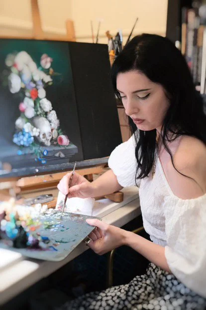
Studio Processes
‘Oubliette’ 2024 Oils on Custom Wood Panel Arch 58 × 36cm
Overcoming Creative Blocks
Jennifer credits her ability to overcome creative blocks by nurturing her curiosity. ‘The biggest thing for an artist is curiosity, just constantly learning and seeking out information for your painting, figuring out what your interests are and then leaning into that.’ She spends 50% of her time developing the work and 50% engaging in activities that promote curiosity; whether that be reading, watching a film, visiting an art gallery, taking a workshop or trying a new medium. Jennifer collects and documents these experiences in her journal. “If I ever do feel like I'm stuck I just have a flick through my journal and I'm like, ‘Oh that's a great idea!’ Then you can expand on it and make a painting from there. It is particularly helpful if you're forgetful like I am.” She treats her journal like a scrapbook, an inspiration book that includes printed images, lists of her favourite artists and her written thoughts about what she likes, which she later develops into a narrative for her paintings.
Sourcing References
Jennifer is an avid gardener and it is this process of gardening that feeds her painting process. ‘I have a small garden because I've been moving around these past couple years but I've always had a lot of indoor plants. I think the garden is just something nice to do before you start your day. It's a calming kind of thing and I think it really brings me a lot of joy. I love watching things grow, seeing the life cycle of things.’

‘Spectre (Requiem for Ophelia)’ Oil on Wood Panel 2020 46 × 60cm
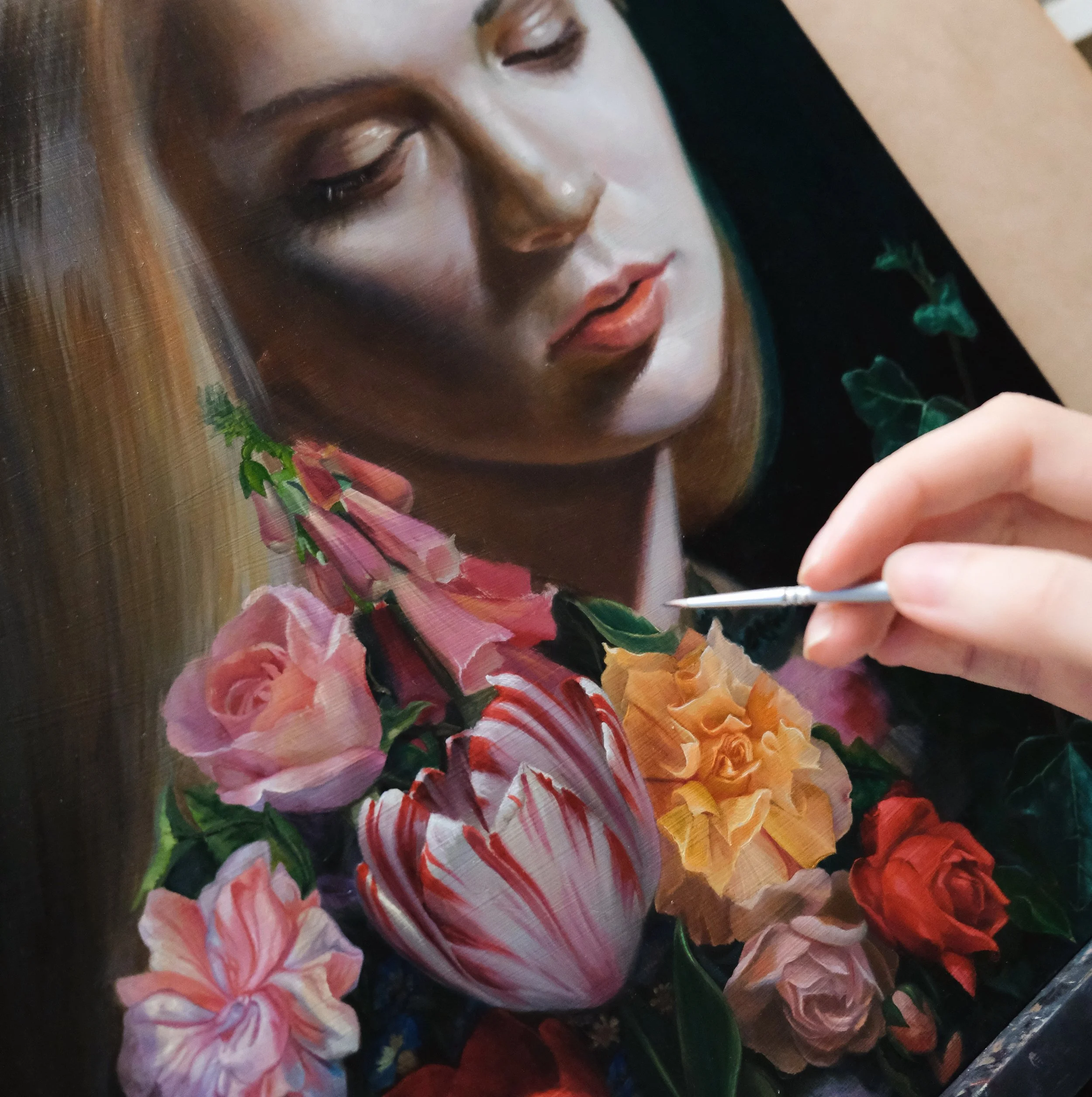
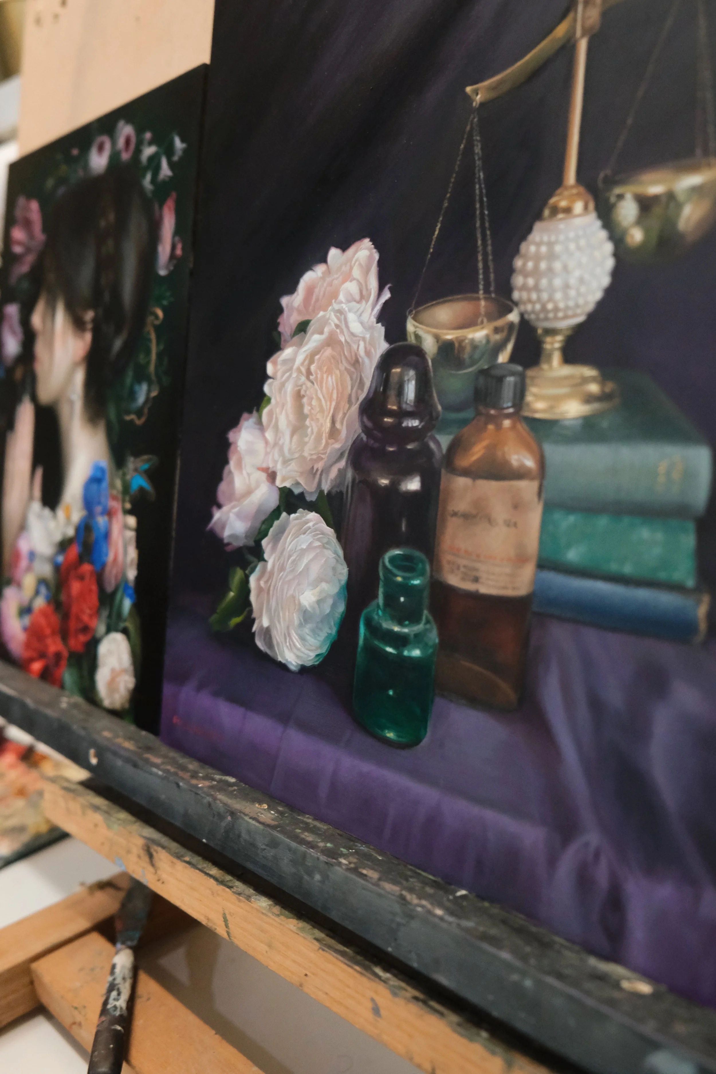
‘I buy a lot of flowers and I photograph them. I'm very traditional, I guess, in some respects. I don't do any digital stuff. I keep visual copies so my technique is generally a collaging sort of method. I do the big flowers first and then collage the rest. It's very intuitive. I really like the intuitive process because it gives me a chance to make changes on the fly. I kind of feel like that's the magic when we make changes on the fly. Things come out of your unconscious and find their way into your work.’ Similar to 17th century artists who would do studies of flowers in season and transfer them to a larger painting, Jennifer takes photos of seasonal flowers throughout the year, sketching and then combining it into the final piece. She compares the process of collaging references to doing surgery.
Temperature
‘Temperature can be something you can really manipulate to create realism. I often paint cool highlights so if I'm doing a portrait the colours on the skin will be fairly cool as a way to create contrast. I like to make my shadows very warm, like warm brown. I add blues into my skin and greens in the highlights, maybe not the centre of the face as it is warm naturally but the chin and forehead will have cool highlights. I really love pale skin. I love painting almost translucent skin when you can see your veins. One of my favourite artists is Rupert Bunny. I love his skin [in his paintings] because if it's in shadow, it's almost like bruised colours.’
Opacity and Transparency
Jennifer alternates between chunky highlights and transparent shadows when she applies her paint. ‘If you get a tube of paint it'll say on the back if it's opaque, transparent or semi-transparent so I'll choose specifically the transparent colours for the shadows to make it fall away, if you know what I mean. The forms in the shadows are unimportant. It's the highlights that are important.’ By applying thick paint to the highlights it creates a natural sort of depth.

‘Kintsugi’ Oil on Aluminium Composite Material 2022 30.5 × 40.8cm
Jennifer’s Choice of Mediums and Brushes
‘I use dreadful brushes, just the cheapest. I get very small brushes like 0 and lower. I prefer synthetic. It is something about the oils that just destroy the brushes. I use the cheapest because I go through them so fast. I know I’m fairly gentle but they tend to fray eventually. I tilt them in a linseed oil bath when I am not painting and then I eventually give them a proper clean in between sessions so I don’t have to wash them every time. I just leave them in there, it seems to make them last a bit longer.’
‘I started out in university days using Art Spectrum but I've slowly transitioned my colours to the more higher end oils. I'm using Michael Harding, I just I love the consistency. I quite like Gamblin and I even have a few tubes of Vasari. I've got a real mix in there. I don't just stick with one brand because of the particular colours I use. For permanent alizarin crimson I only use Winsor and Newton because I really love how they do it. The Rublev brand is quite interesting because they don't use any stabilisers in their paint so it's meant to be more traditional but they're a bit harder to get.

‘The Theory of Equivalent Exchange’ 2020 Oils on Baltic Birch Panel 26 × 26cm
A Guiding Principle
Michelangelo at the age of 80 stated: 'At last my apprenticeship is finished, I am ready to begin.’ Jennifer reflects, 'There is such a truth in that because you’re constantly learning. I haven’t got it all figured out and hopefully fingers crossed I get to 80, I can finish my apprenticeship and move on to the real artwork. That is the beauty of art, it does not matter what stage you are at with painting, you’ll always feel like that. Part of the joy is pushing yourself to a new level.’
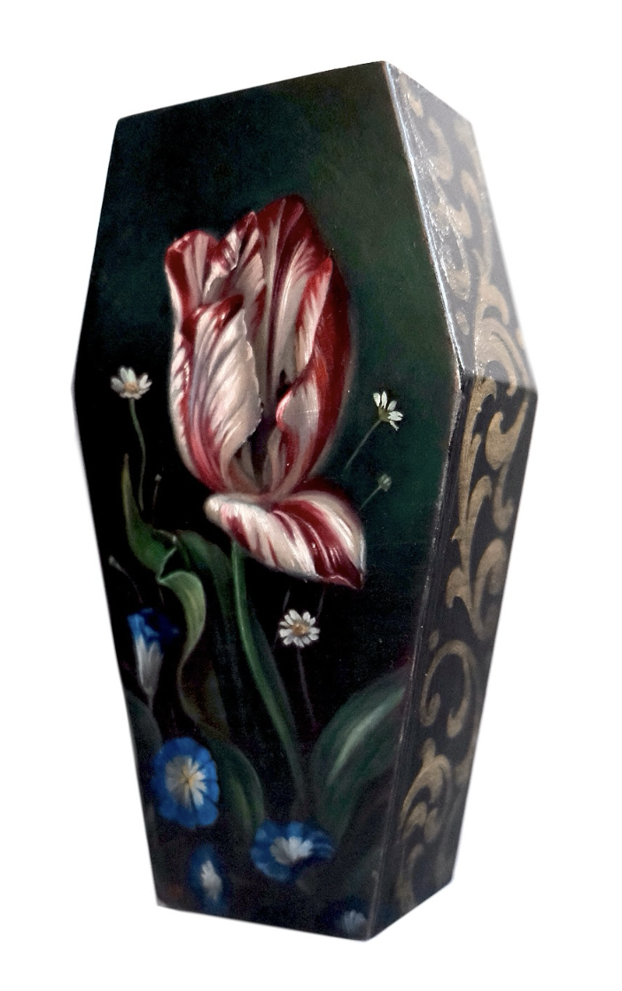
‘Coffin Tulip’ 2024 Oils on Custom Coffin Panel 9.5 × 17.5cm
In the face of AI and contemporary conceptual art Jennifer’s practice continues to value time-honoured traditions of beauty. To quote one of her favourite lines from Dostoevsky’s novel, ‘The Idiot’, ‘Beauty will save the world.’ Jennifer explains, ‘This quote asserts that beauty is truth, truth is beauty and beauty has the power to inspire and elevate humanity. It is the idea that pursuing and appreciating beauty in all things can have a transformative and redemptive influence on individuals. Beauty brings us closer to the sacred and helps us recognise the divine within ourselves.’
Thank you, Jennifer for reminding us that beauty is integral to us as human beings and for championing these values in your work.
For more information and to view a collection of Jennifer’s work, click on the link below:
https://www.jenniferallnutt.com/
Instagram: @jennyallnuttart