Developing Colour Confidence with Anne Smerdon
‘Be concerned with accurate colour not accurate brushstrokes.’
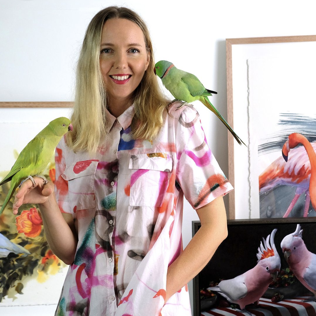
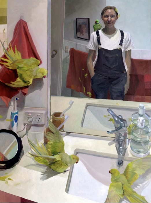
Anne Smerdon is an award-winning Australian artist focused on the complex but often-overlooked minds and personalities of animals, particularly birds. With an extensive knowledge of bird psychology and body language, Anne uses her work to raise awareness and educate others about protecting and caring for our wild and captive birds. In 2016, Anne founded The Artory, an art school that specialises in teaching ordinary people (both kids and adults) how to unlock their creativity and have fun with art.
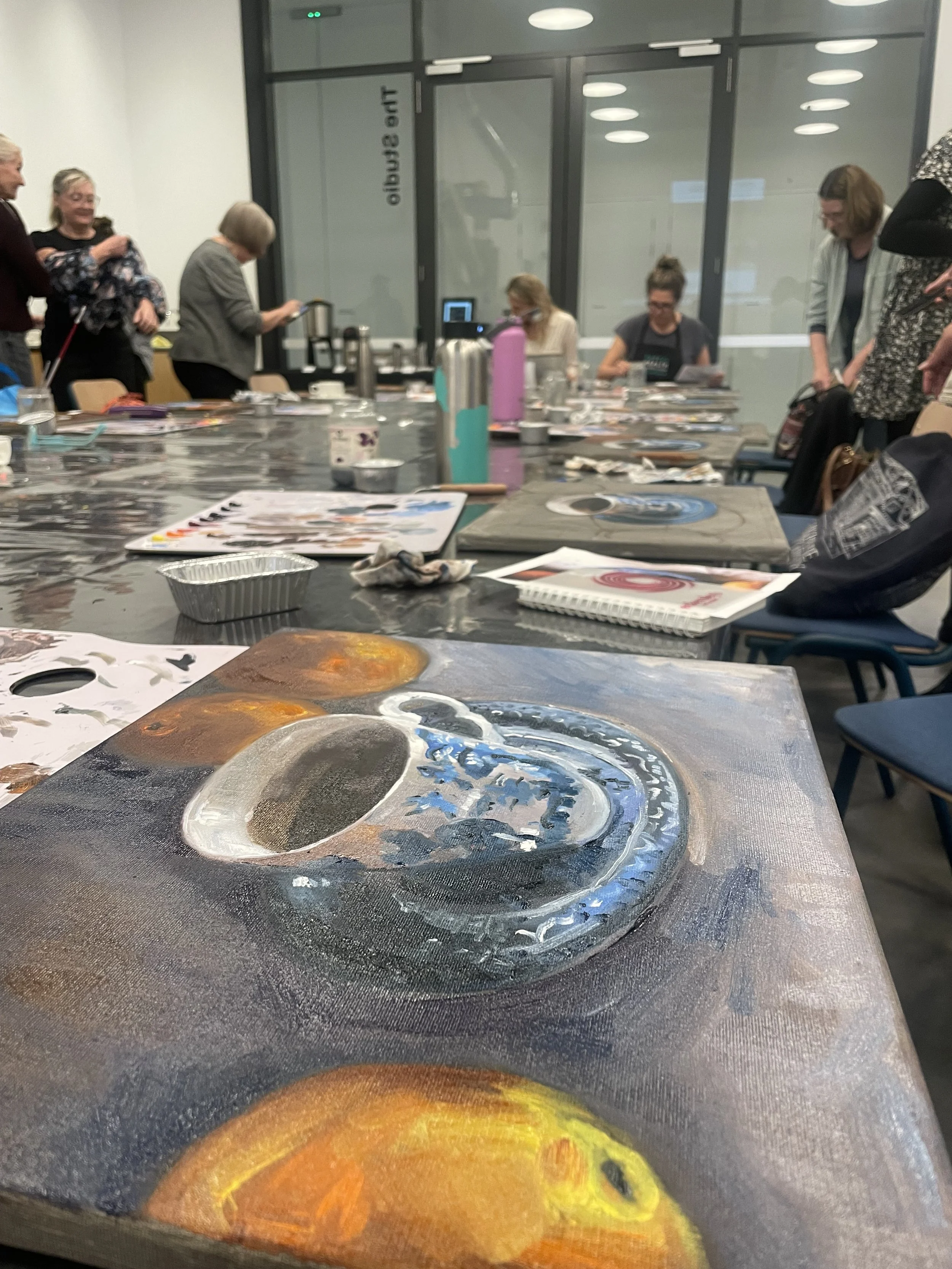
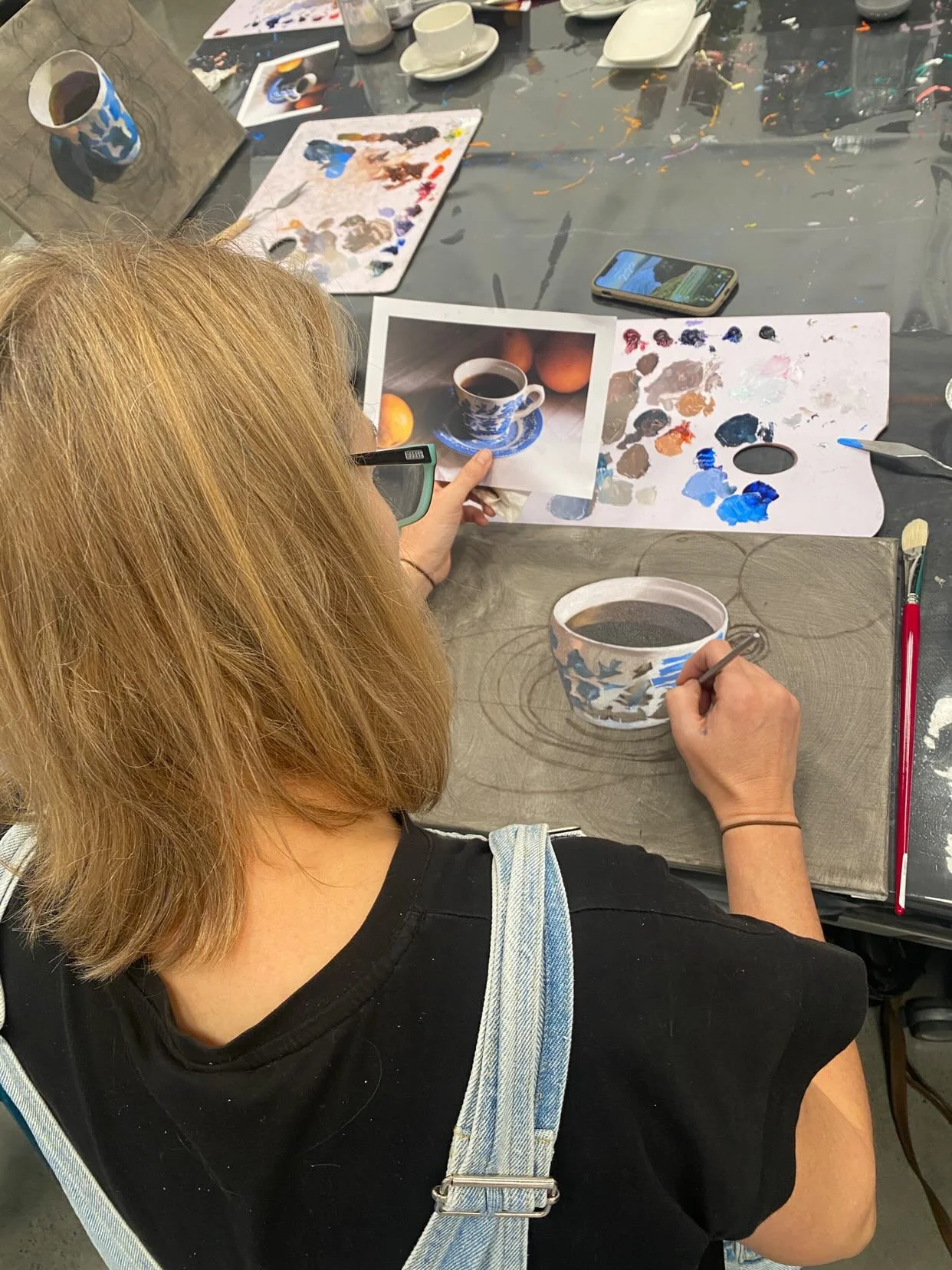
During June, I had the pleasure of attending a workshop by Anne Smerdon, hosted by the HOTA (Home of the Arts). During the workshop Anne stated something profound, ‘Be concerned with accurate colour, not accurate brushstrokes.’ I had previously thought of colour as a secondary element in my painting process. So concerned with the narrative, symbolism, composition and fine detailed brushwork; colour had always been the last element that I had considered when developing a painting. Even though I had been an art educator for over twenty years, never did I consider the degree to which colour could be such a pivotal part of my own painting practice.
Understanding Colour Perception
For years I had struggled to understand why my colours looked so different on the palette to when I painted them on the canvas. Often I would remix and rework a section of a painting several times because the colours did not look accurate. Anne explained that when we put colours on a white canvas it makes the colours look darker because of the contrast. Colours can also seem different dependant upon which colours sit next to each other. So how do we solve this problem when our eyes play visual tricks on us? One solution is toning our canvas first with a neutral colour like a grey. This way our eyes have a mid tone by which to judge each colour. The second solution is when we begin a painting, we start with the darkest and lightest colours in the image so we can measure all future colours according to these. It was remarkable what difference this made when I began to assess my colour mixing and build my painted layers.
Mixing Colours
Anne demonstrated that if you mix your colours with a palette knife and hold it up to your reference you should be able to assess whether it is a perfect match. Be sure to shut one eye when assessing with the palette knife. If the colour blends into the reference then the colour is accurate. While I often paint at night and my lighting is not always the best, this technique has helped immensely. I would encourage you to use a metal palette knife when you work through this process as a white palette knife may affect your visual perception.
Anne talked about chroma which comes from the Greek word ‘khroma’, meaning purity or intensity of colour. This is the most pure form of colour that comes straight out of tube. To dull a colour rather than using black, use the opposite colour on the colour wheel. Greys can also be created by mixing opposite colours plus white. Anne advised to mix the lightest and darkest of each colour first so that these are prepared well in advance of applying the brushstrokes to the canvas.
Another important instruction for colour palette organisation was to work in ‘strings rather than puddles.’ What does this mean you may ask? Anne highlighted that you mix all your original colours or ‘mother colours’ in one line at the top of your palette. From there when darkening or lightening a colour, mix them in one line underneath as to not taint the original mix. It also helps visually so you can compare your colours. I thought this advice was so practical as my palette often ends up in one big hot mess, so disorganised it is difficult to work out where I started. Last night I was tempted to revert to my puddle making approach due to laziness, but I stopped myself. It is important to apply what you have learned in order to develop a better art practice.
Anne’s Colour Palette
During the workshop we used Winsor and Newton’s Winsor student oil range however in Anne’s art practice she uses Langridge oil paints and mediums. They are Australian made and uncompromising in quality. Their paints have a very high pigment loading and are based on contemporary high-saturation colours. Anne told us that a Phathlo Green is more intense and stronger than a Viridian Green so this is her choice of green as it has more impact.
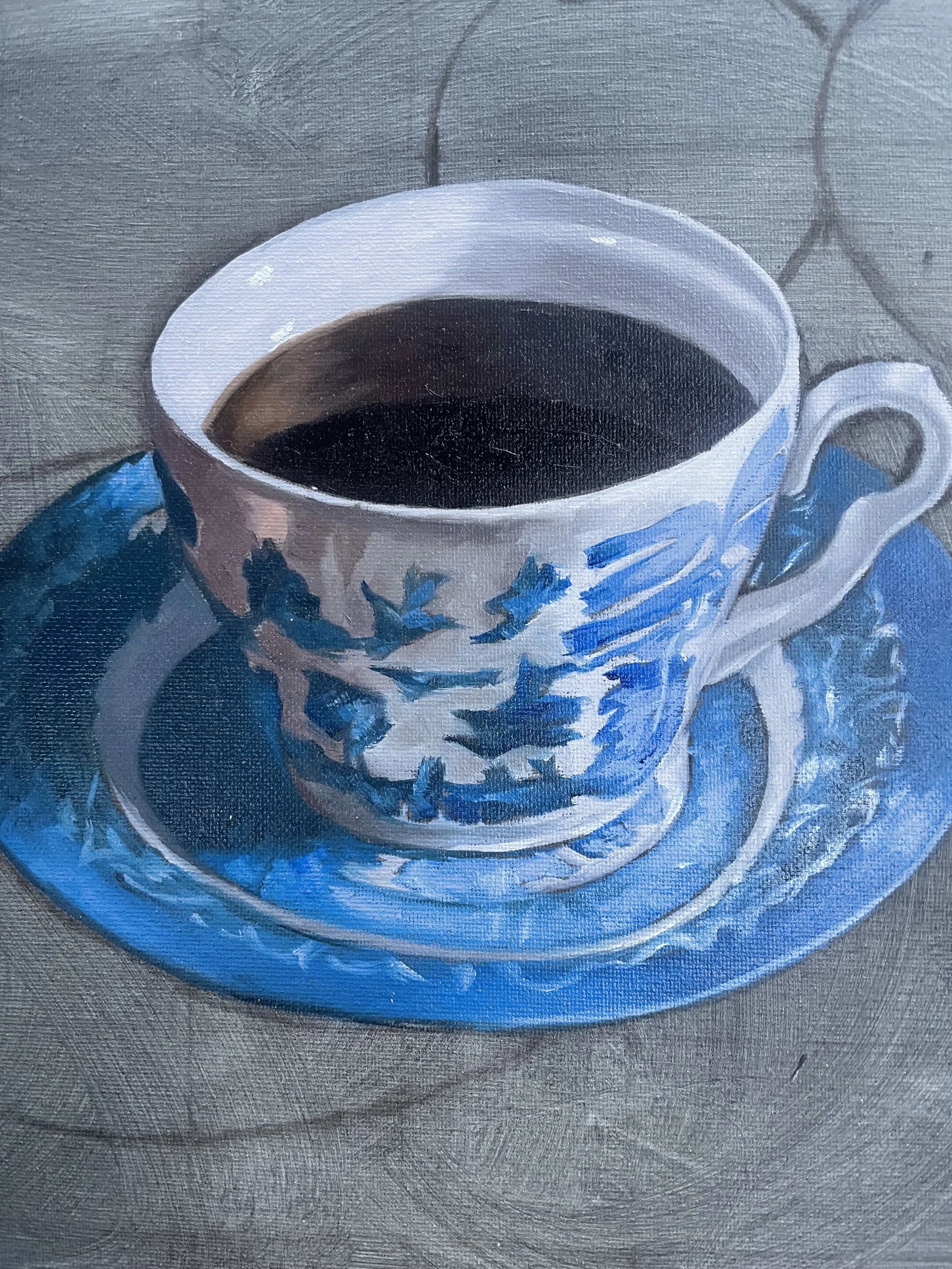
Since I have been recently painting Blue Willow China in my own series of works, I was particularly interested in the choice of colours she uses when painting this subject. For the lighter tones of the china design we mixed Phthalo Blue and Quinacridone Magenta and the for darker areas Phthalo Blue, Transparent Red Oxide (Brown) , Quinacridone Magenta and the slightest smidge of Cadmium Yellow.
Titanium White
Cadmium Yellow PY35
Cadmium Yellow Deep PY35
Transparent Red Oxide PR101
Cadmium Red PR108
Quinacridone Crimson PR19?PR179 (sometimes called Permanent Alizarin)
Quinacridone Magenta PR122
Dioxazine Violet PV23
Phthalo Blue (Red Shade) PB15.1
Phthalo Green (Yellow Shade) PG36
During the workshop students used Archival Oils Odourless Solvent for cleaning brushes and Archival Oils Refined Linseed Oil as their medium. However, Anne uses the Langridge brand of medium and solvent. Apparently Landgridge Solvent 75 is the lowest toxic solvent in the world which is good to know to keep those nasty fumes away.
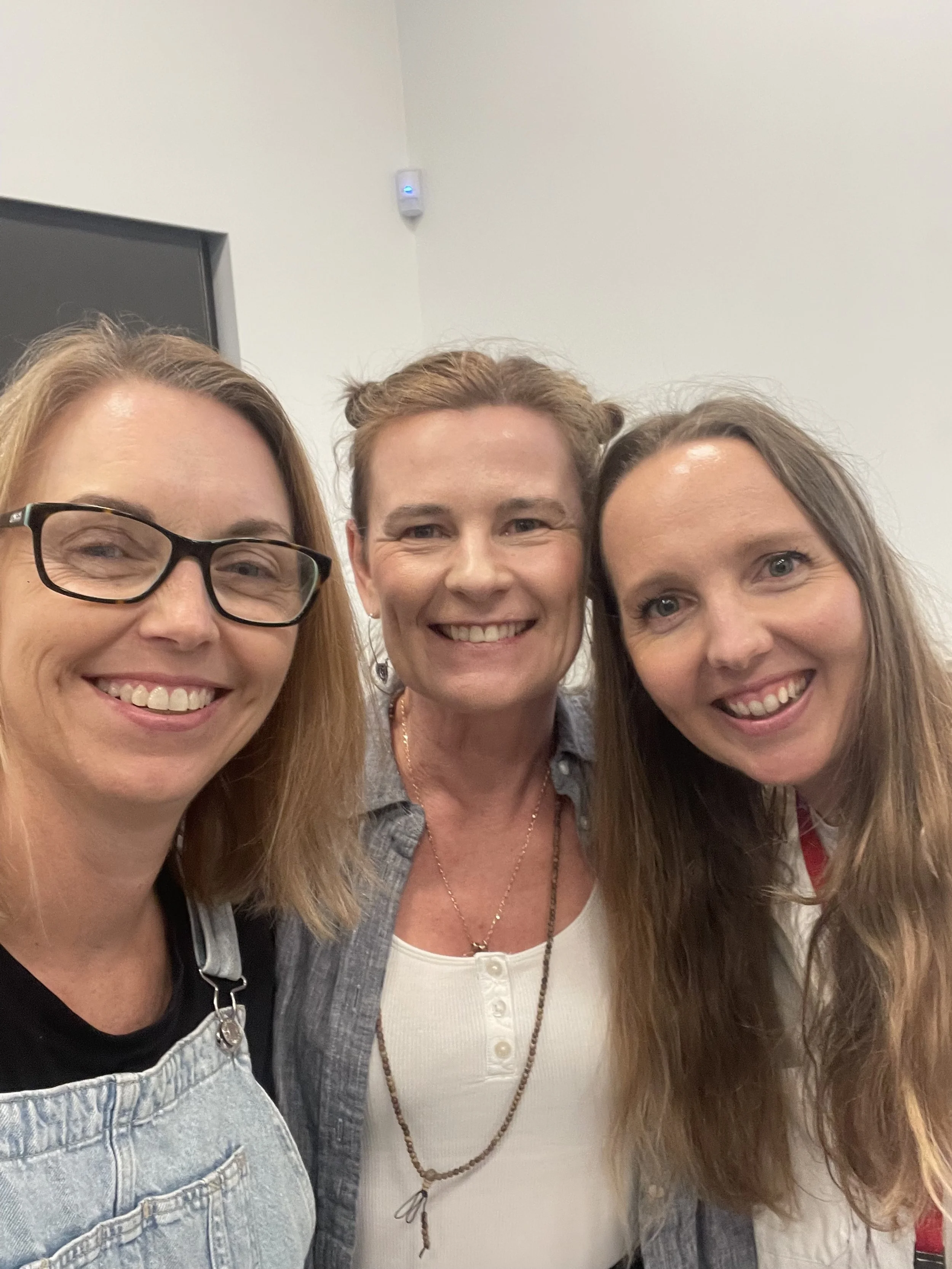
Thank you, Anne, for your informative workshop on how to approach colour in oil painting. It has definitely impacted the way I develop my colour palette and my perception of how artists can best approach colour application. For someone who is so fixated on details, you are forever going to be one of the artistic voices in my head telling me to, ‘be concerned with accurate colour not accurate brushstrokes.’
If you are interested in perusing Anne’s stunning collection of artworks or would like to hear more about her art classes click on the link below:

